I care deeply about the opinions of interior designers. In the age of Pinterest, we’re all doing our best to make our design dreams a reality, but professional decorators are aware of things my Instagram-molded mind can barely grasp. They know the right paint colors, proper dimensions, and where to find high quality in unexpected places. That expertise also undoubtedly results in a list of staunch interior design no nos.
Creativity and aesthetic expression are deeply personal, but knowing how to avoid these crimes against design can steer your style in the right direction. To get a better sense of the choices that send interior designers running, I polled a variety of talents for their biggest pet peeves.
Featured image by Michelle Nash.
- The 10 Biggest Interior Design No Nos: The Experts
- Designer Pet Peeve #1: Curtains That Are Too Short
- Designer Pet Peeve #2: Mixed Metals
- Designer Pet Peeve #3: Ill-Fitting Rugs
- Designer Pet Peeve #4: Art Hung Too High
- Designer Pet Peeve #5: All Furniture Bought From the Same Place
- Designer Pet Peeve #6: Inconsistent Bulbs
- Designer Pet Peeve #7: Too Much Recessed Lighting
- Designer Pet Peeve #8: Plantation Shutters
- Designer Pet Peeve #9: White Trim on Colorful Walls
- Designer Pet Peeve #10: Prominent Microwaves
The 10 Biggest Interior Design No Nos: The Experts
- LA designer Francesca Grace
- Joelle Kutner and Jesse Rudolph of LA-based OME Dezin
- Jessica Risko Smith of Santa Barbara-based JRS ID
- Tamarra Younis of Union of Art Interiors
- Andi Morse of Atlanta-based Morse Design
- Shannon Eddings of Shannon Eddings Interiors in Austin, Texas
- Ashley Macuga of the Bay Area’s Collected Interiors
- Lauren Sullivan of Well x Design
- Annie Downing of Austin-based Annie Downing Interiors
Designer Pet Peeve #1: Curtains That Are Too Short
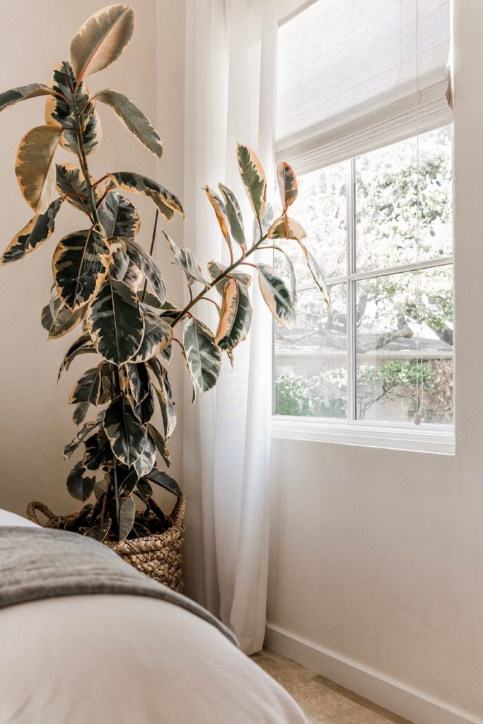
Having covered home design for several years, curtains that don’t quite meet the floor are one design pet peeve I’m well aware of.
“When it comes to window treatments, a curtain rod that’s installed too low or a curtain panel that is too short are both huge no nos,” explains Tamarra Younis. “The last thing a designer wants to see is a floating line above the floor.”
“My preference is that the curtains hang high (close to the ceiling) and lightly touch the ground,” adds Shannon Eddings. “They don’t necessarily have to be custom to hang appropriately—though custom is worth every penny. As long as the hardware is hung at the correct height then the curtains should hit the floor right!”
Designer Pet Peeve #2: Mixed Metals
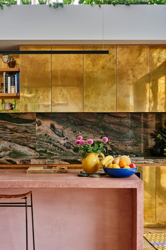
“There are some little things that are really big to me,” says Jessica Risko Smith. “One is mixing polished chrome and polished nickel metal finishes.”
Designer Pet Peeve #3: Ill-Fitting Rugs
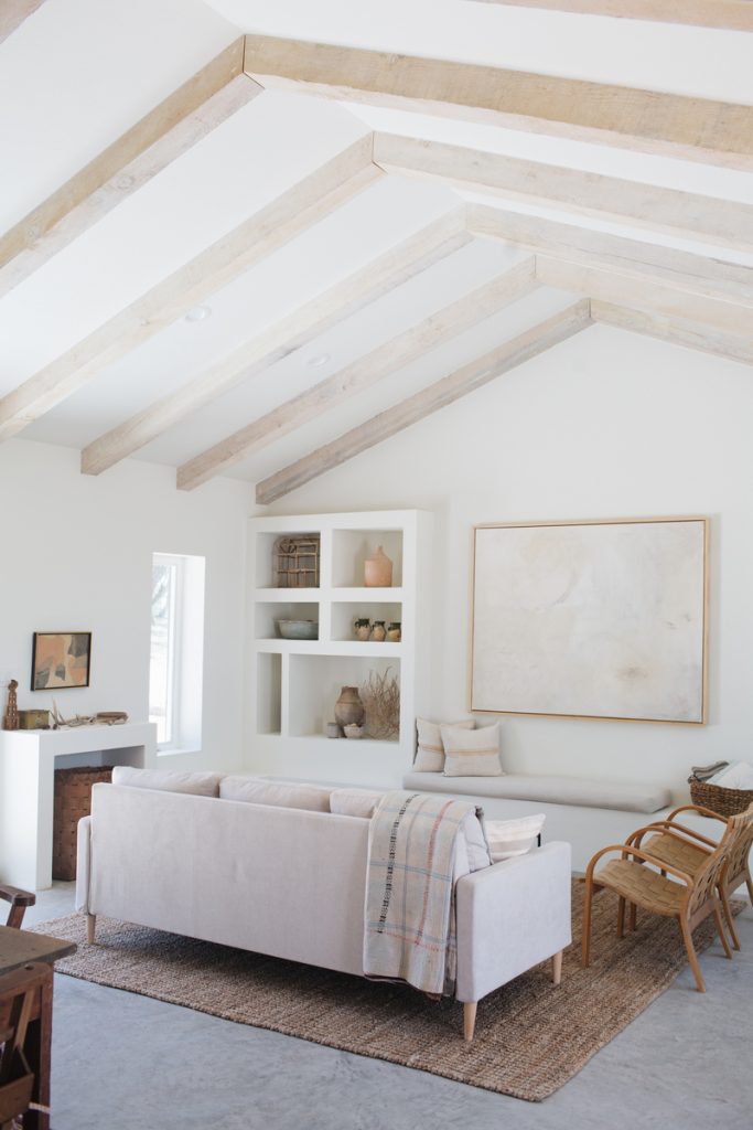
When it comes to rugs, which either blend in beautifully or stand out like a sore thumb, size matters.
“One of the biggest pet peeves I have is seeing a rug that is too small in a room,” shares Andi Morse. “It makes the room feel ill-fitted and smaller than it actually is. A rug should ground a space. It helps make the room feel put together and finished.”
Lauren Sullivan adds, “When in doubt, bigger is almost always better.”
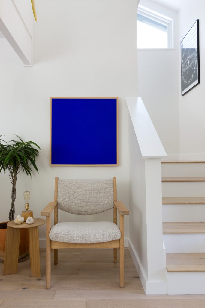
Designer Pet Peeve #4: Art Hung Too High
“This drives me crazy because a piece of art hung too high can really offset the entire space making it feel unbalanced and out of proportion,” says Francesca Grace.
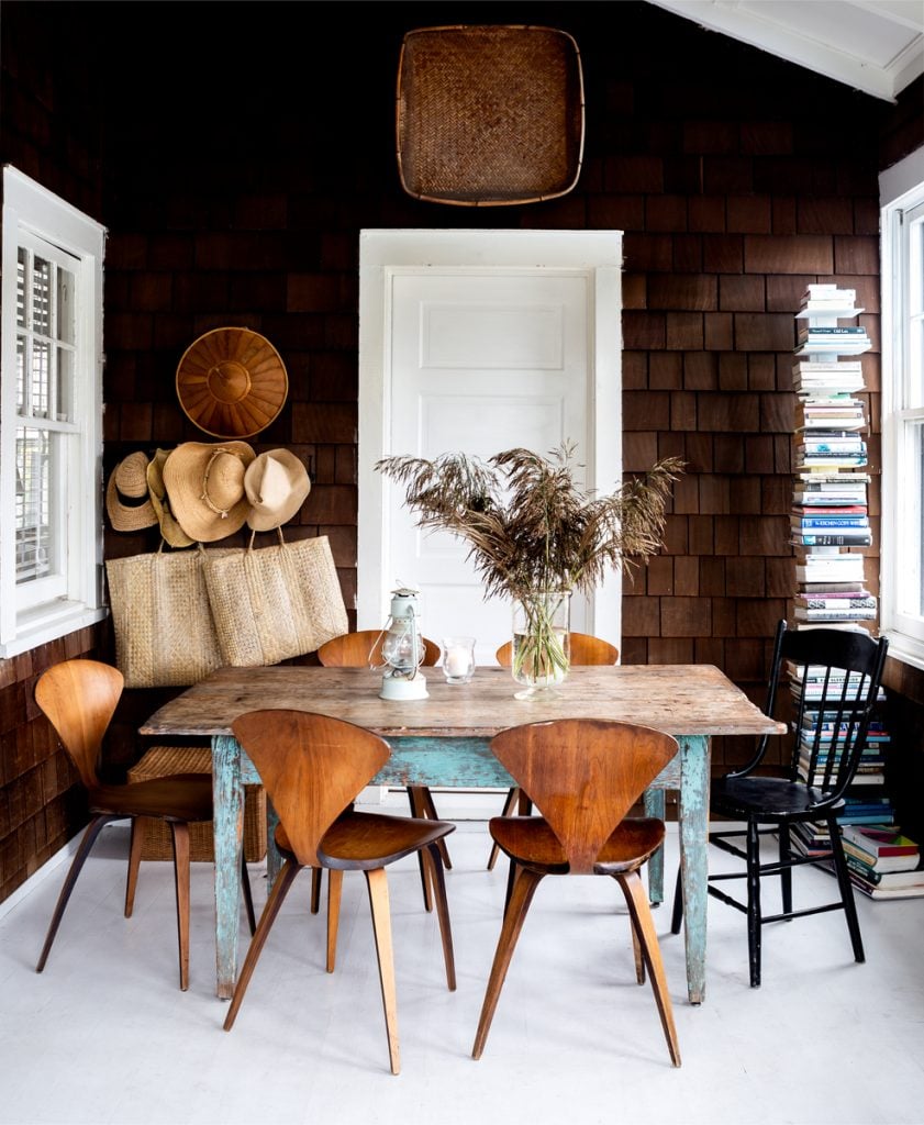
Designer Pet Peeve #5: All Furniture Bought From the Same Place
While it’s tempting to go all in on Memorial Day Sale, patience is key for a collected, eclectic feel.
“Don’t feel the need to buy all your furniture at once,” advises Joelle Kutner. “You should look at every piece in your home like a collection that you build upon. This ensures every piece is thoughtful and special. You can source items online or even at flea markets, making for a fun weekend activity. Filling your space too quickly is a no-no.”
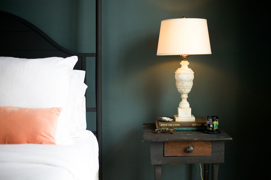
Designer Pet Peeve #6: Inconsistent Bulbs
These days, you can customize a smart lightbulb to create countless moods. You can set the color, the brightness, or alternate from daylight to soft light. Just try to pick a theme for each room and stick with it.
“A random mix of different color light bulbs in a single room makes us designers crazy!” says Younis. “When buying bulbs, pick a color tone and wattage that you like and be consistent. Nothing ruins the sexy feeling of a dimmable lamp more than an 80-watt blue-tone daylight bulb.”
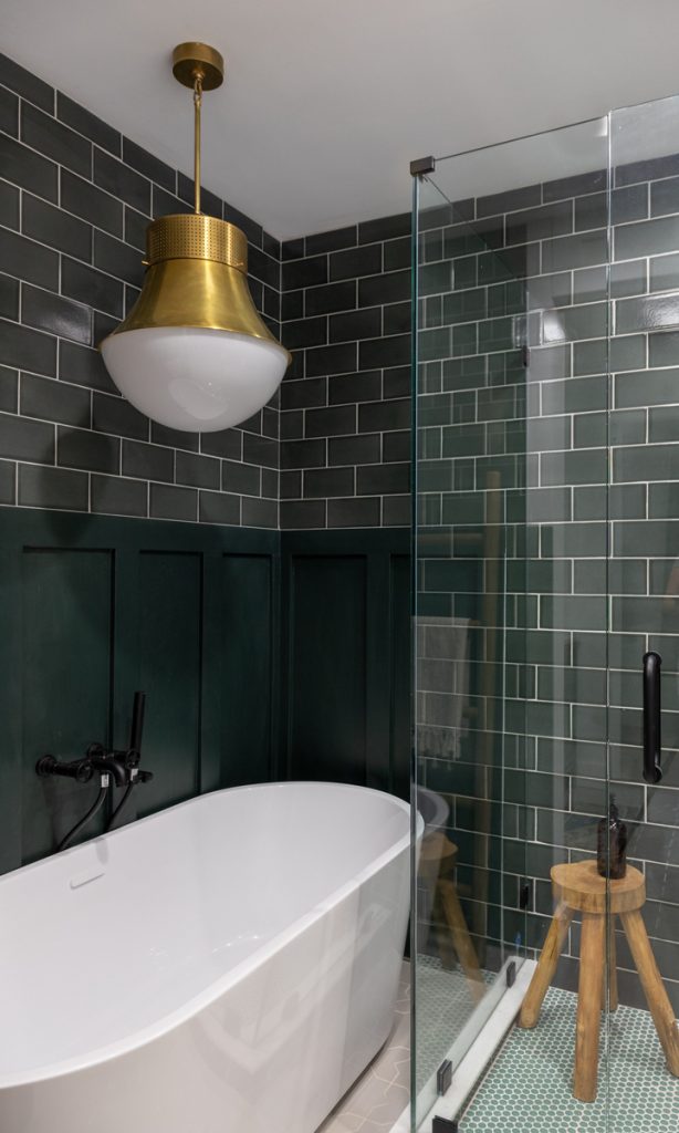
Designer Pet Peeve #7: Too Much Recessed Lighting
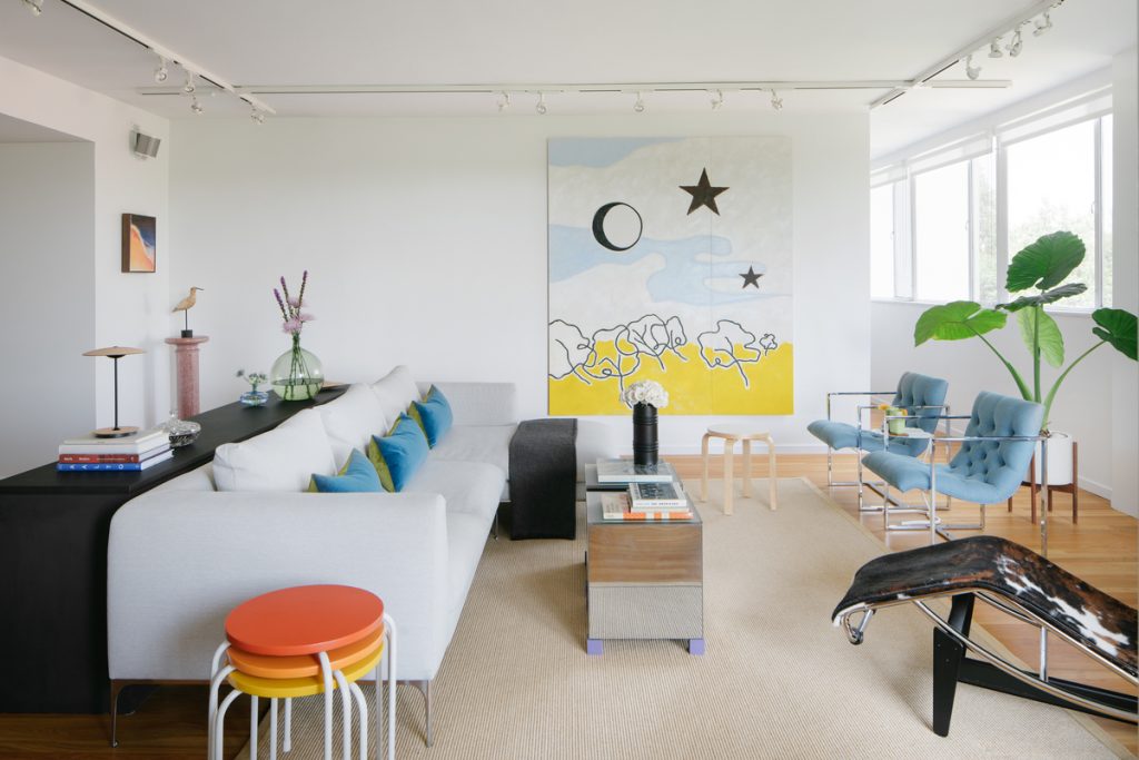
“Recessed lights lining a ceiling like an airport runway make me cringe every time,” says Sullivan. “Instead, opt for flush mount fixtures or monopoints and always incorporate lighting from multiple sources. Never rely solely on overhead lighting!”
Designer Pet Peeve #8: Plantation Shutters
In addition to thinking up a new name for them, Morse (who it should be noted lives in Atlanta, Georgia), is ready to ditch plantation shutters entirely.
“I prefer drapes or pretty shades,” Morse notes. “Plantation shutters add no decor to the room. They can be similar in price to other forms of window treatments that are warmer and provide more ambiance to the space.”
Designer Pet Peeve #9: White Trim on Colorful Walls
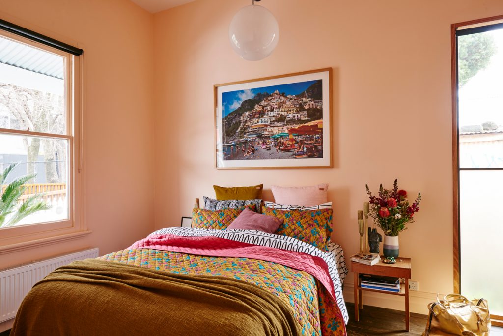
“I find that it undermines what could be a sophisticated statement,” shares Annie Downing. “Commit to color, go tone on tone, or use complementary hues.”
Designer Pet Peeve #10: Prominent Microwaves
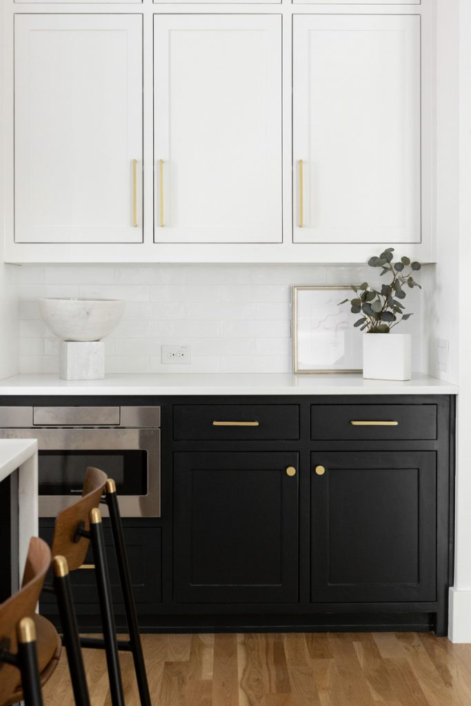
While Ashley Macuga is most adamant that microwaves not be above an oven range, the designer would rather not see the device anywhere in the kitchen.
“Our team believes that ranges are a visual focal point of a kitchen, and love to enhance their impact with a range hood that adds to the overall aesthetic of a space,” says Ashley Macuga. “We work to hide microwaves as much as possible—on the back of an island or even inside a pantry.”


