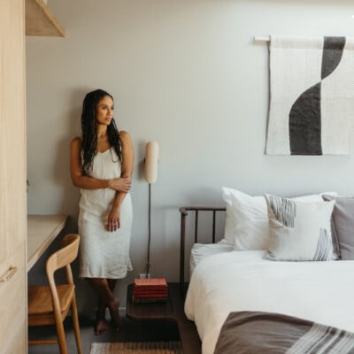
Sarah Solis wasn’t planning such an extensive remodel. A refresh of the outdoor areas and a few interior updates were in the cards. But once Solis began to chip away at the rustic California farmhouse she shares with her husband and two children, “one thing led to another,” says the Los Angeles-based founder and principal of Sarah Solis Design Studio. “My husband returned from a work trip one day and the entire house was stripped to the studs—you could literally see through it.”
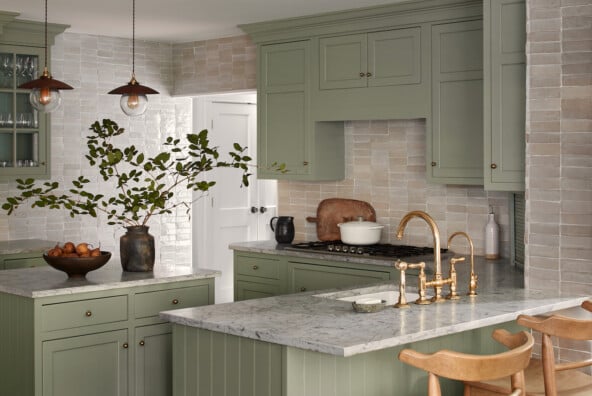
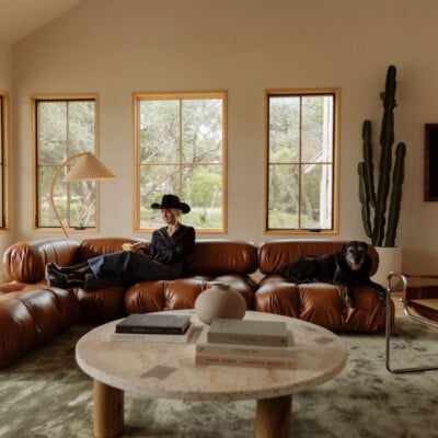
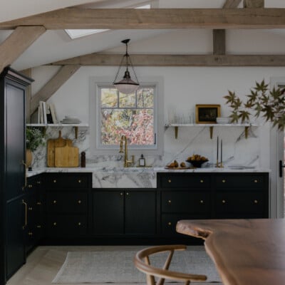
Such a sweeping renovation may not have been planned, but it certainly feels meant to be. The finished space is the epitome of California rustic modern. Everything flows. Natural elements of wood and marble marry with the warm Los Angeles light. An airy kitchen washed in the color of clouds gives way to a high-ceilinged living room anchored by a dark linen sofa. It’s a study of understated opposites: warm and cool, bright and moody, rich and airy.
Feature image by Shade Degges.
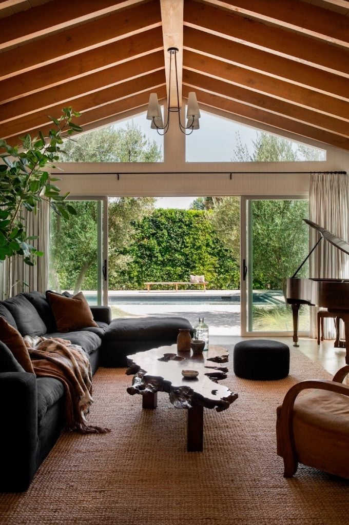
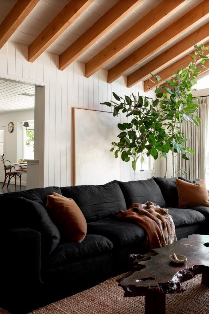
Even more so, the home is very Sarah Solis. The designer, who is known for her love of wabi sabi, has a knack for embracing the beauty in imperfection. Solis chose wood wall paneling with “knicks and dents and physical imperfections,” exposed beams made of Douglas Fir salvaged from a Kansas barn, and reclaimed European white oak wood flooring that has “beautiful inconsistencies.”
Like every great designer’s intention, Solis’s home is a work of beauty. It’s also a space of intention. As she walks us through her design process below, one thing becomes clear: this is a home for living in the present.
This home, which was built in 1954, has such a vibe. Take us through some of the unique elements of the original architecture.
There is an incredible use of open and closed spaces in the house. We balanced high vaulted ceilings to achieve big awe moments and breath of space with low ceilings where we wanted cozy, comforting spaces. For example, the dining room and library have lower ceilings and are painted darker tones to create super cozy intimate settings. They invite you to get comfy and stay a little longer.
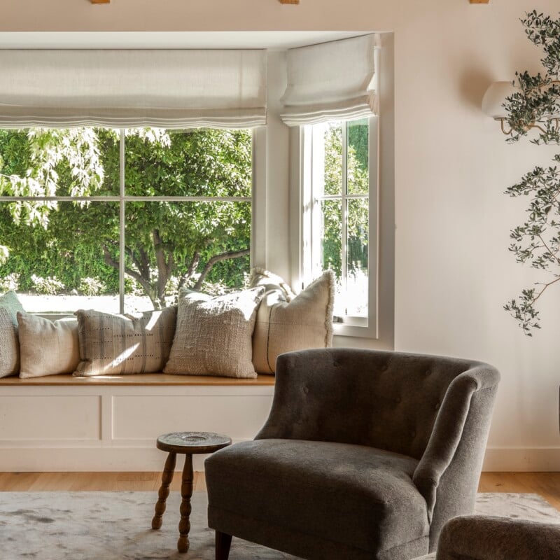
One of the most special features are the bay windows and reading nooks in every bedroom. It’s a romantic ideal that I always dreamt of having as a child. So when the opportunity presented itself, we leaned in! We doubled down with creating a built-in banquette in the kitchen, as well.
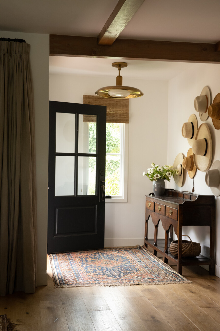
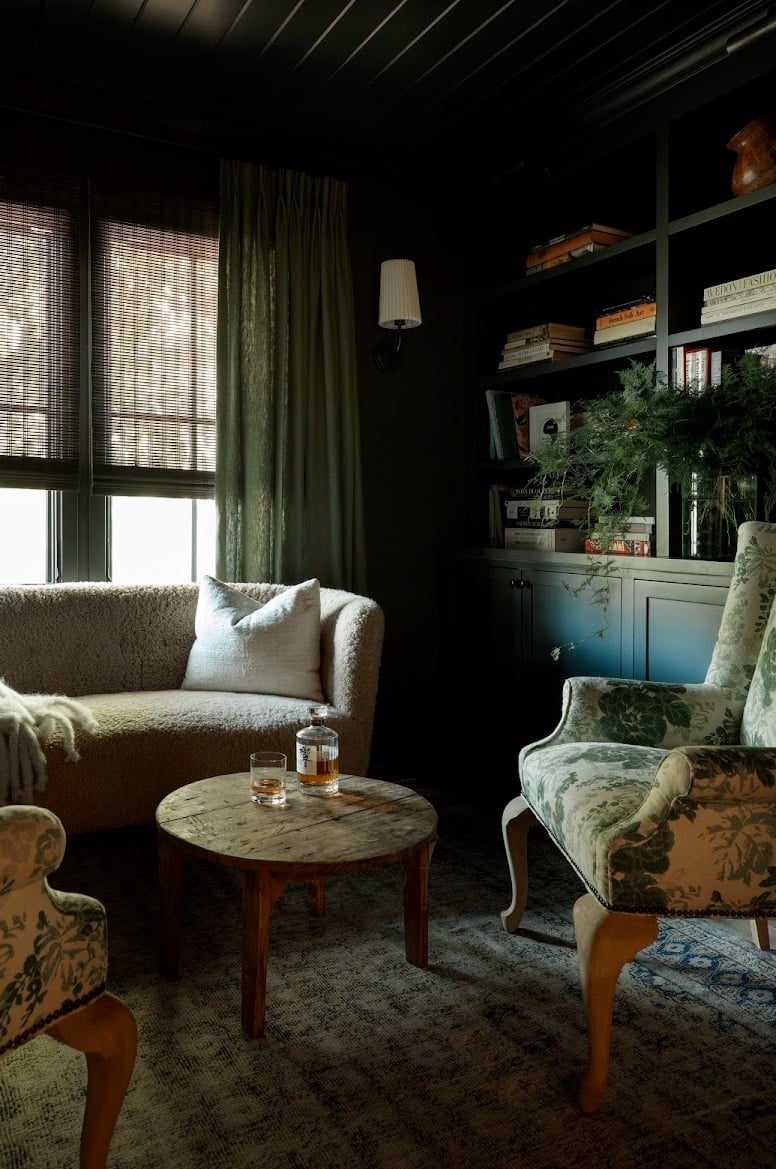
You extensively renovated this space while honoring the original bones. What are some of the main changes you made?
We changed the floor plan to create an elegant and functional flow. The kids’ bedrooms are on one side of the house and the primary suite is on the opposite side. There is a central hallway that creates a calming center and architectural axis while also making the home feel longer, bigger, and more expansive.
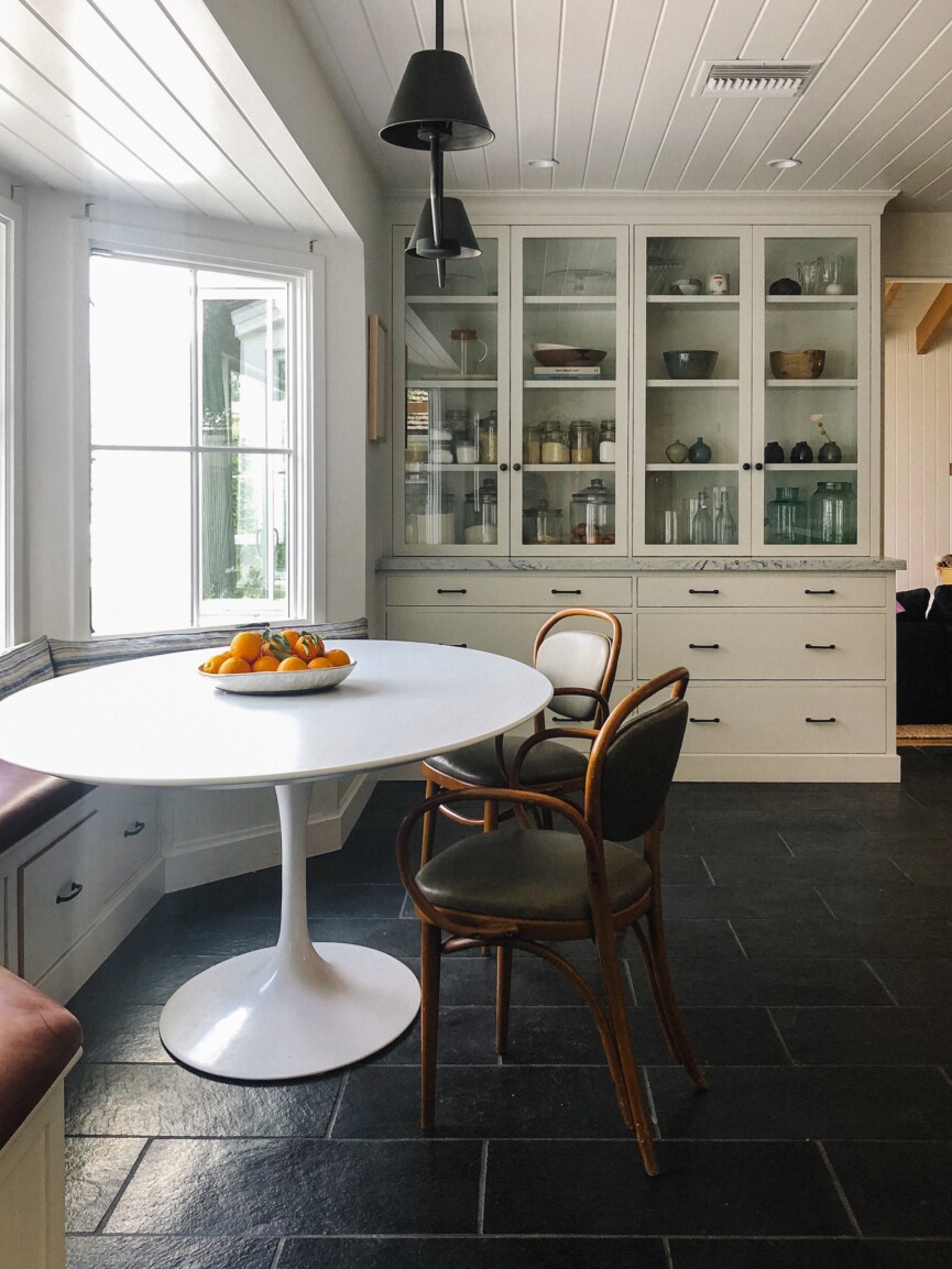
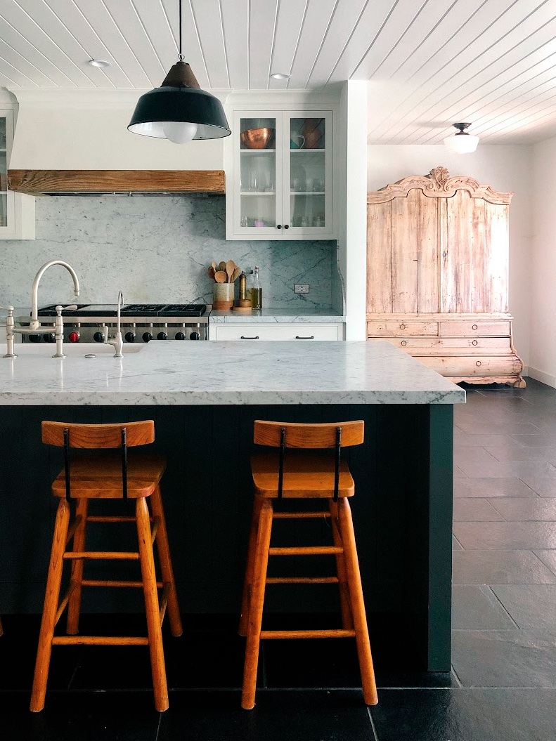
Images by Rennie Solis
The center of the home is for entertaining and gathering. We expanded the great room with a vaulted ceiling and added square footage. This created the heart of the home off of the kitchen.
We added vertical wall paneling in the great room and a few extra beams for more interesting detail, rather than traditional heavy moldings. We played up the kids’ bathroom with wall paneling as well.
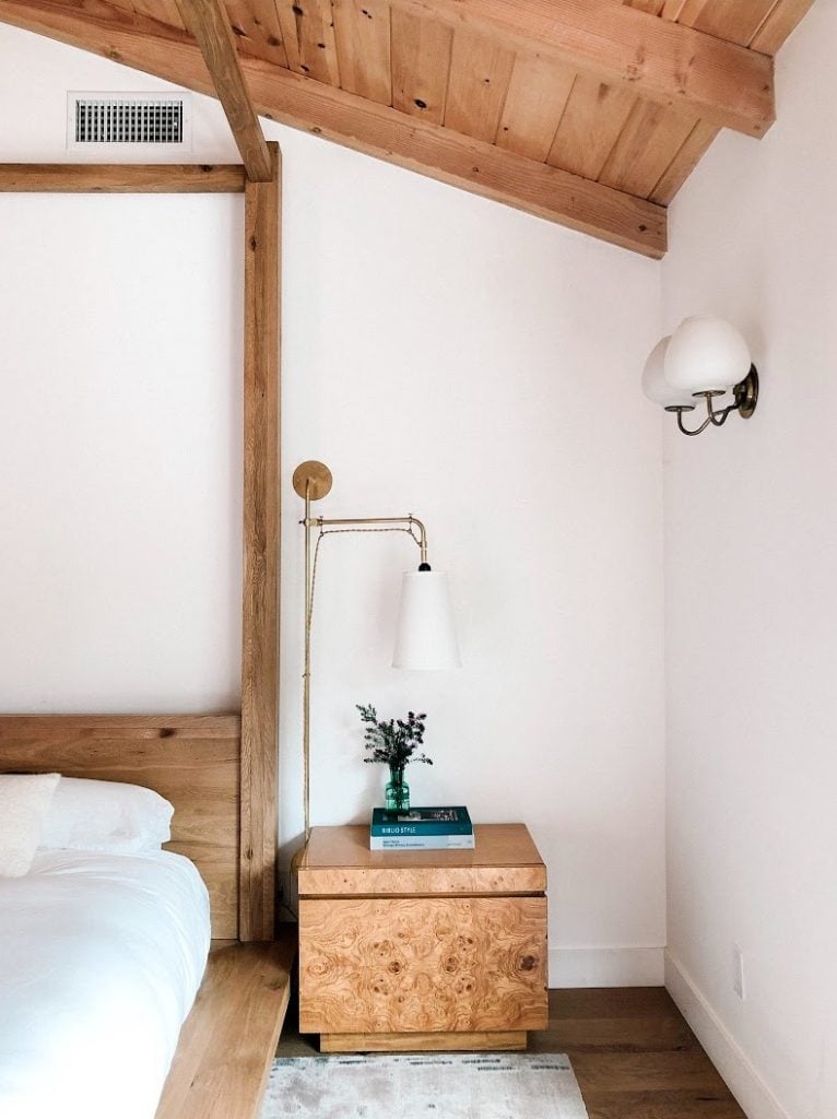
Wood, natural light, and organic hues and tones reign. How did this come into play in your decorating process?
That’s my personal aesthetic! Variations of neutrals and natural wood are the foundation of my design work. This palette is very calming for me. It’s serenity. It also allows my ever-rotating collection of great finds to effortlessly cycle through my home as singular bold moments. I’m constantly sourcing and falling in love with pieces and then moving them to a project that best suits their design.
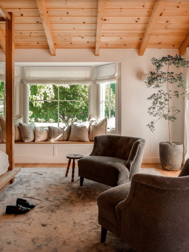
What is unique about the property?
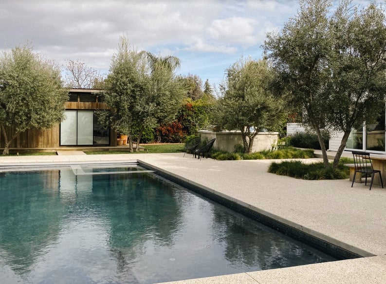
The coolest part about this property is that it is a fully contained acre of land in the middle of the city. It’s unassuming when you drive up to the single-story, low, sprawling classic California ranch house. Once you enter the home the magic of the space is mesmerizing, the whole way through to the backyard.
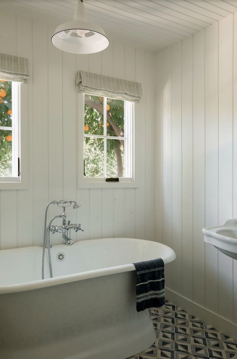
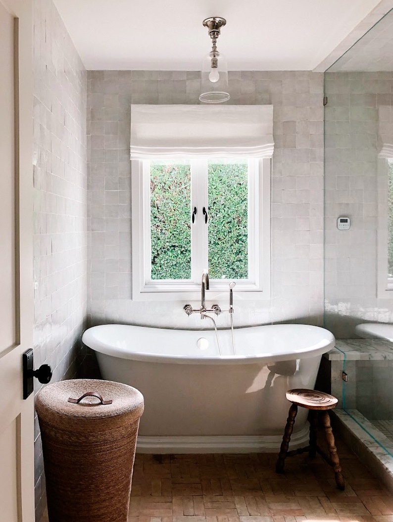
“Everything is calm, grounded, and complementary to the surrounding nature outdoors.”
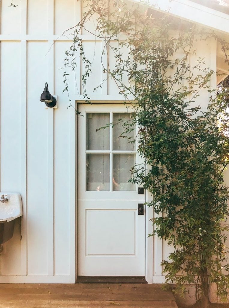
The guest house is just as charming—if not more charming—as the main house with an outdoor shower enclosed in reclaimed barn wood. The property is pure magic with a tennis court and an area we call “The Farm” with multiple raised garden beds and a generous chicken coup for our chickens, “The Ladies.”
“My goal was to create a serene and cozy home that transported you out of the Los Angeles lifestyle, so it felt like you were somewhere else in the world.”
What piece of decorating wisdom Would You Like to share?
Try not to crowd a space. Let a space breathe to give it balance. Not everything you love will work together so it will be a loving practice of restraint. Embrace the process.
