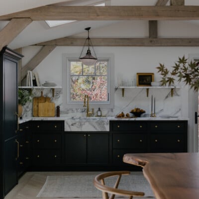
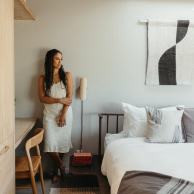
Relocating your life to the other side of the world is no small feat. After moving our small family from Australia to Los Angeles six years ago, I know firsthand how challenging it is to say farewell to your beloved community of family and friends not to mention familiar surroundings, culture, and food! But there is always so much more to be gained than lost—just ask Jodie Fried. The former Sydney-based co-founder of Armadillo made the trek 11 years ago with her husband, Greig Fraser, and their three children. And while they have relished every minute of their beach lifestyle in the hip Venice neighborhood of Los Angeles, one of the things they really missed was the Australian perspective on architecture and design.
So, when it came time to build their own home, they merged the California Aussie aesthetics to create a beautiful fusion of both worlds.
“Our Venice House was all about weaving the antipodean architectural details that we couldn’t find in America,” Fried explains. “Greig and I love Australian design, known for its subtle nuances of natural light, proportion, airflow, and quality materials. We found ourselves in the unusual position of wanting both worlds and were determined to bring that Australian architectural culture, which we missed so much, into our life and home in Venice.”
To achieve this, they took the rather “unconventional approach” of engaging renowned Australian architect, Hannah Tribe of Tribe Studio (who is based in Sydney) to design and build their home. “Together, we really dialed into this idea of worlds colliding—Australia meets California, indoor merging with outdoor, and functional family living blended with an elevated design sensibility,” she recalls.
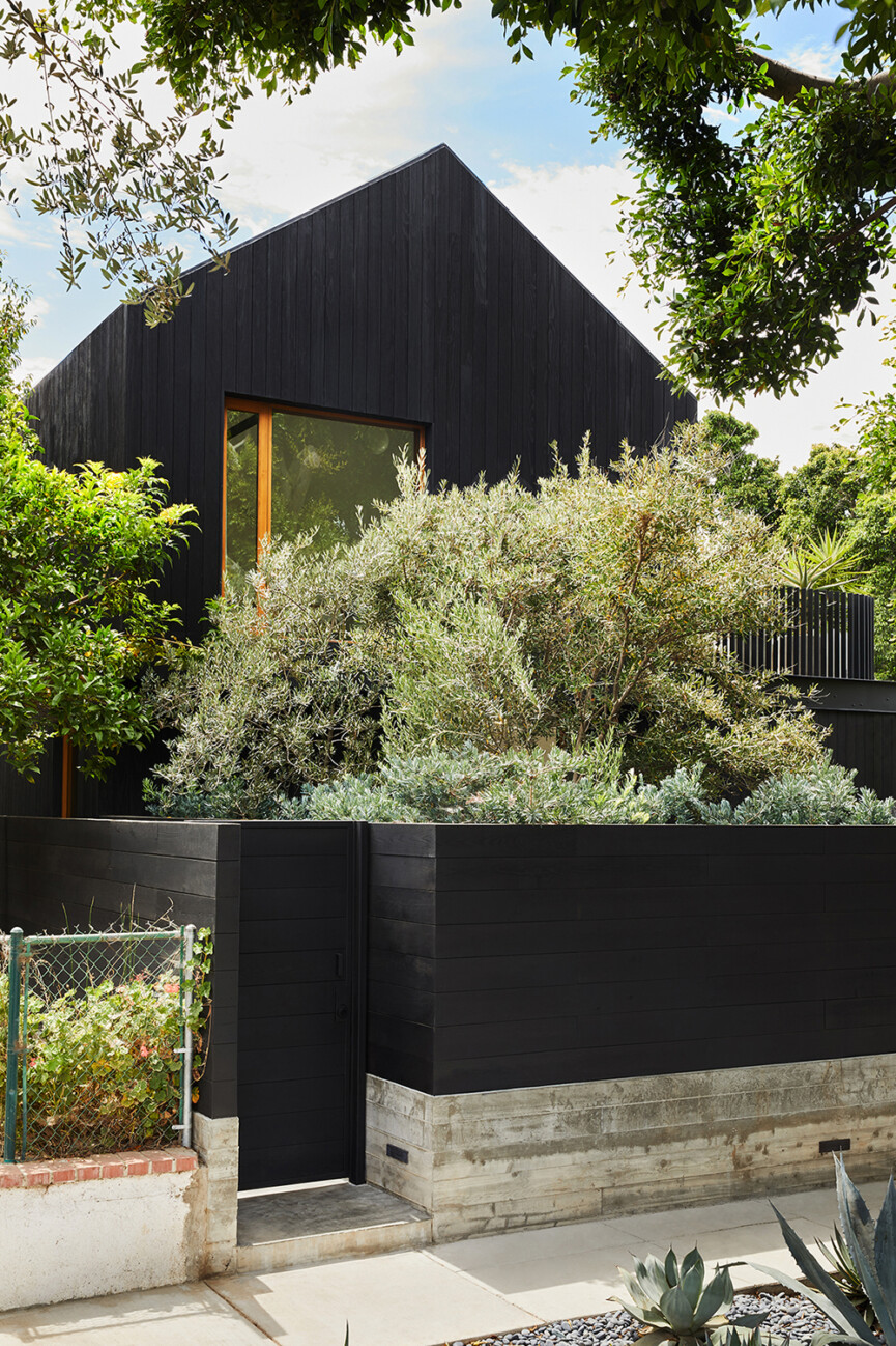
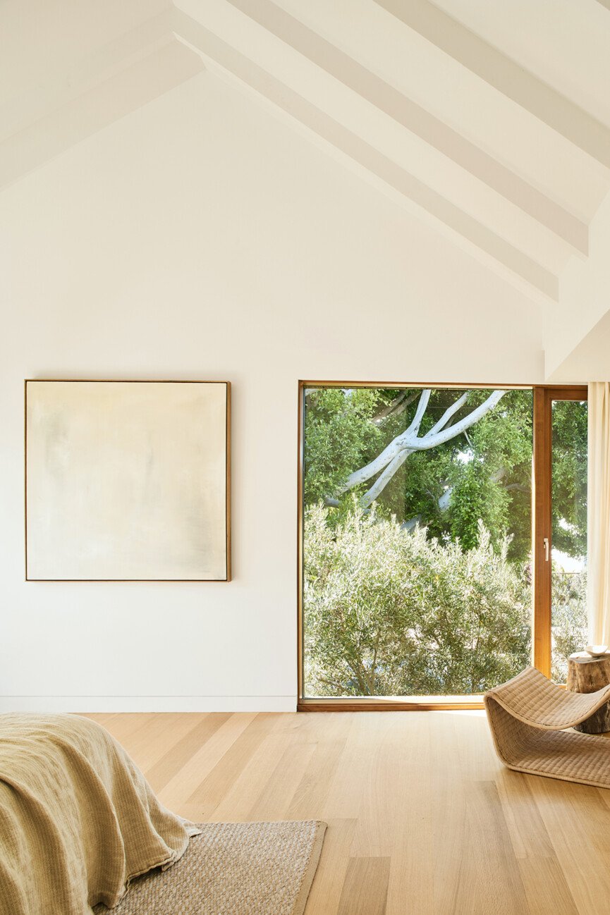
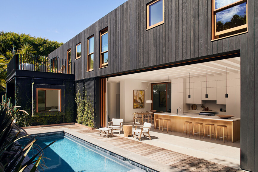
As for the original house? It was a charming Californian bungalow that had been built in the 1920s on the Venice canals, then transported to this plot of land in the 1950s. While “incredibly quaint and full of character” Fried says it couldn’t be salvaged, so they tried to capture its essence in their new build. “One of the old bungalow’s features was its little pitched roof, which our architects paid tribute to,” she recalls. “The upper level, where the main bedroom is, doesn’t sit flush against the walls of the lower level, so it has this quirk of feeling like its own little house sitting atop another house.”
Read on to learn more about this stunning Australian/California design meld, the inspiration, the process, design tips, advice, and so much more! Get your “pin” finger ready for major inspo ahead.
What was your personal goal/vision/directive for the space?
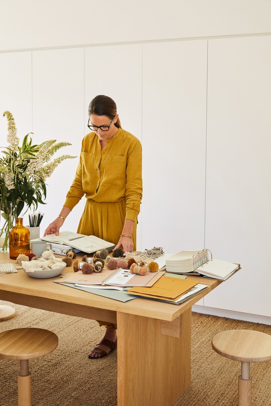
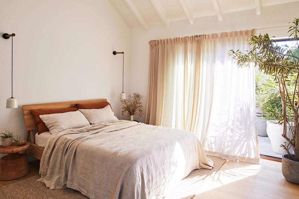
The plan for décor was to keep things distinctly minimalist and Australian, which meant supporting Australian brands. I worked with friend and design consultant Arabella McIntosh—an Aussie expat who has a very grounded style–in selecting the lighting, furniture, and furnishings in every room. Key lighting pieces were from Melbourne-based Anchor Ceramics, along with all the doors and handle hardware from Designer Doorware.
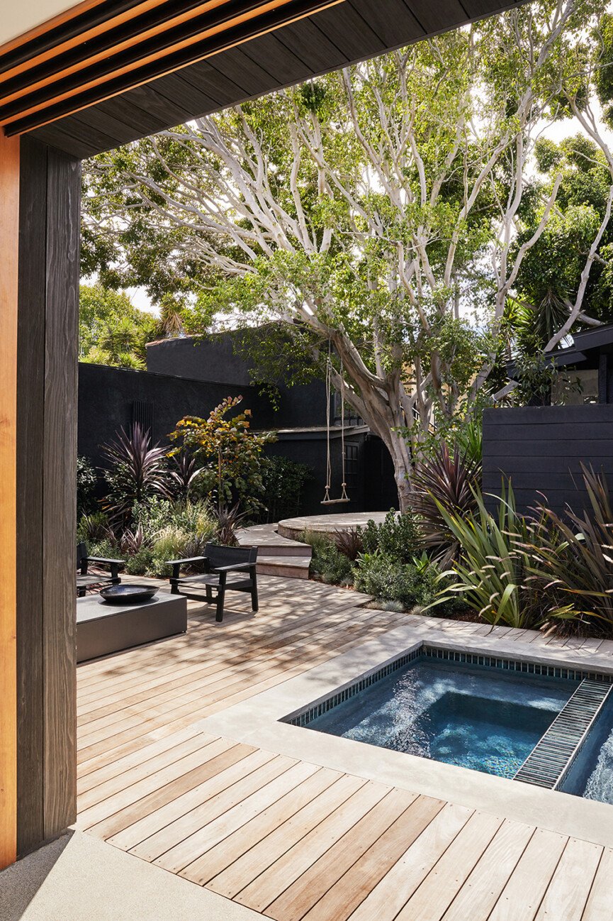
Outside, we used Eco Outdoor for the pool coping, deck crazy paving, and bluestone steppers. Other outdoor furniture and the fire pit were sourced from Harbour Outdoor. In the main bedroom, we have the most sumptuously soft linen bedding from another Australian brand, Cultiver. And throughout the home are pieces of art from Australian artists including Belynda Henry, Rachel Castle, and Marnie Gilder (a dear friend of mine), just to name a few. Being surrounded by these beautiful Aussie tones and textures really resonates with us and our aesthetic.
How would you describe the home’s architectural style and how did it influence the design process?
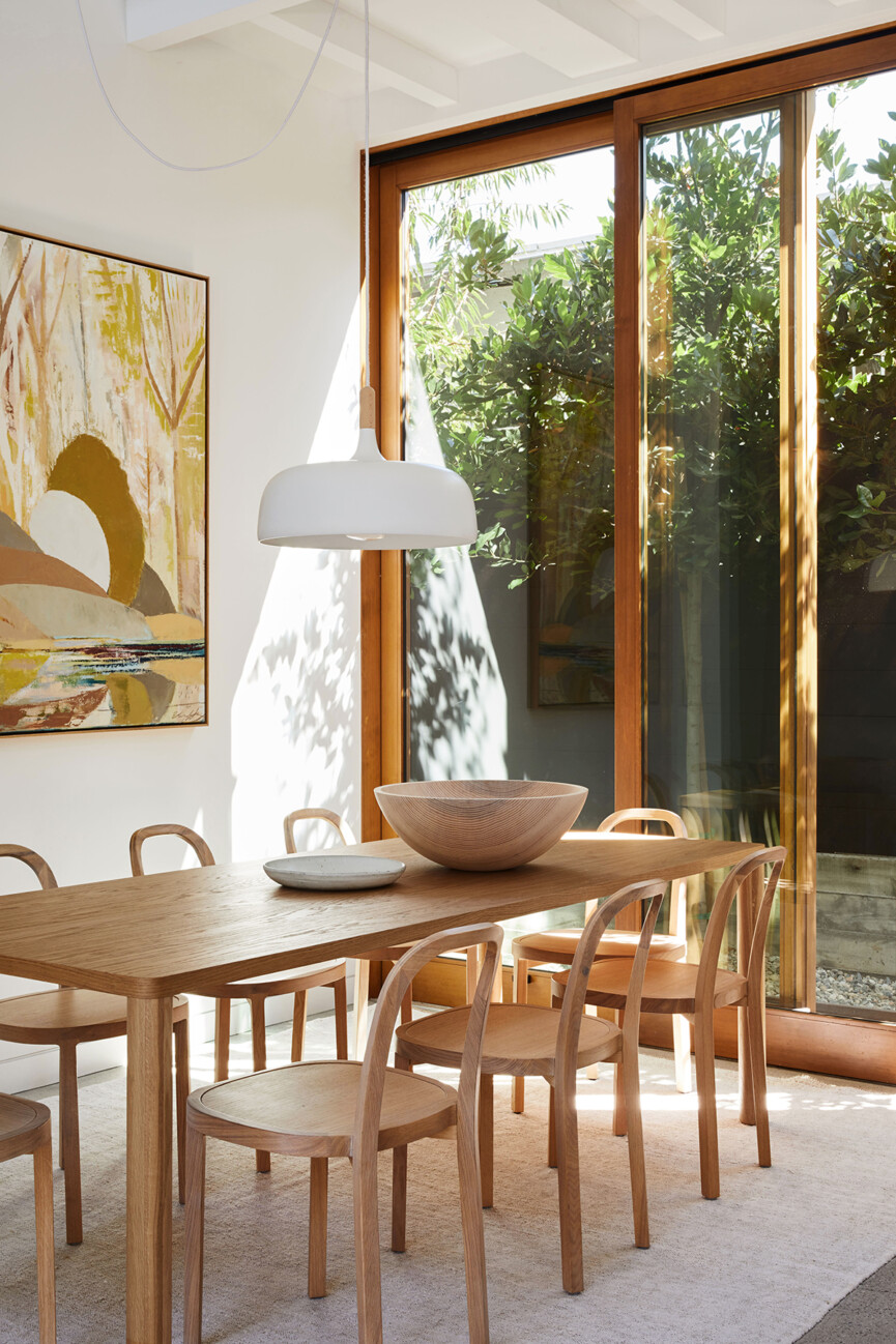
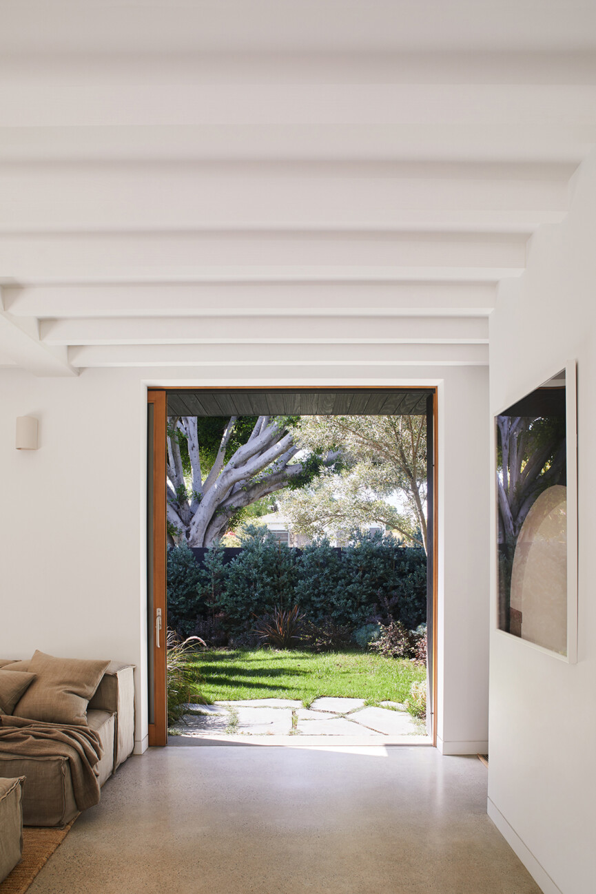
While we were exposed to a lot of modern architecture in LA, none of it really spoke to us. We soon realized that we couldn’t find what we were looking for, which was a design sensibility that we’d grown up with—high ceilings, open spaces, indoor-outdoor living, and a respect for light and air—cultural nuances that only an Australian would be able to identify with. It was then that we decided to take it upon ourselves to bring Australia to Venice.
The brief to Hannah was to bring that exact magic that we couldn’t find, the casual yet discerning spirit so typical of our country into our Californian world. The integration of indoor to outdoor living is another trait that is synonymous with the Australian lifestyle.
Can you tell us more about the Australian architect you collaborated with? What did she bring to the table?
I have always admired Hannah’s work, so it was a dream that she said yes and we were able to bring her iconic aesthetic into the unruly and eclectic environment of Venice. As an architect, she is known for her empathetic, experimental, and clean-lined work, which is also influenced by her background as an artist and her personal experiences as a mother.
In particular, Greig recognized a sensitivity in her work and her ability to design outside the boundaries of architectural logic. We felt that her design approach came from a uniquely rich and feminine perspective, where her ideas weren’t necessarily conventional but made total sense creatively.
Despite the strong use of steel and wooden beams, expansive walls, and straight lines, Hannah’s design sensibility created a house that was full of soul, playfulness, and warmth, providing a perfect capsule for our world and our family to happily co-exist.
The design process was extremely collaborative with Hannah and her team in Australia, as we shared ideas, held workshops, and sent plans back and forth for years while we were living in between LA and London. Our passionate builders described the Venice House as a “jewelry box” and it was wonderful watching them figure out the complex and unexpected design, with details not normally seen or constructed within American architecture.
Hannah intuitively understood the focus and importance of our family, food, friends, children, and indoor-outdoor living and was able to seamlessly incorporate all those elements into an architectural form that first and foremost brought great joy but was always practical as well as beautiful.
Describe the surrounding neighborhood—how does your home adhere to the LA/California vibe or does it totally break the mold?
Our family has lived in Venice since we first put down roots in LA. Located just a few blocks away from the beach, it has a classic Cali vibe that lends itself to our family life. To be able to go for a surf or a swim as part of your day-to-day lifestyle is just so healthy, both physically and mentally. At the same time, Venice is slightly edgy and eclectic with this diverse community of like-minded, colorful creatives—artists, filmmakers, writers, musicians, foodies, and a lot of expats!
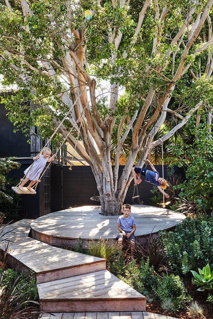
Even though it has been gentrified over the years, you still feel its underlying roots in the fabric and diversity of the neighborhood. Where our home does embody the nature-centric lifestyle of Venice, with our downstair space flowing directly outdoors, it does break the mold of the very modern styles we are surrounded by.
How would you describe your style and approach to design/decorating?
Our vision for this house has been about 10 years in the making because the home encapsulates everything that we came across in our travels together that we loved. We banked so many ideas from experiences we had with architecture and design overseas, which we then threaded into the design of the home. You would often find me taking photos and sourcing door handles from a hotel in Mexico, or Greig discreetly taking the dimensions of ceiling heights and doors in the strangest of places! We started dreaming of this well before we had our children, and the architectural vision just kept evolving as our family grew.
How did you decide on the color scheme?
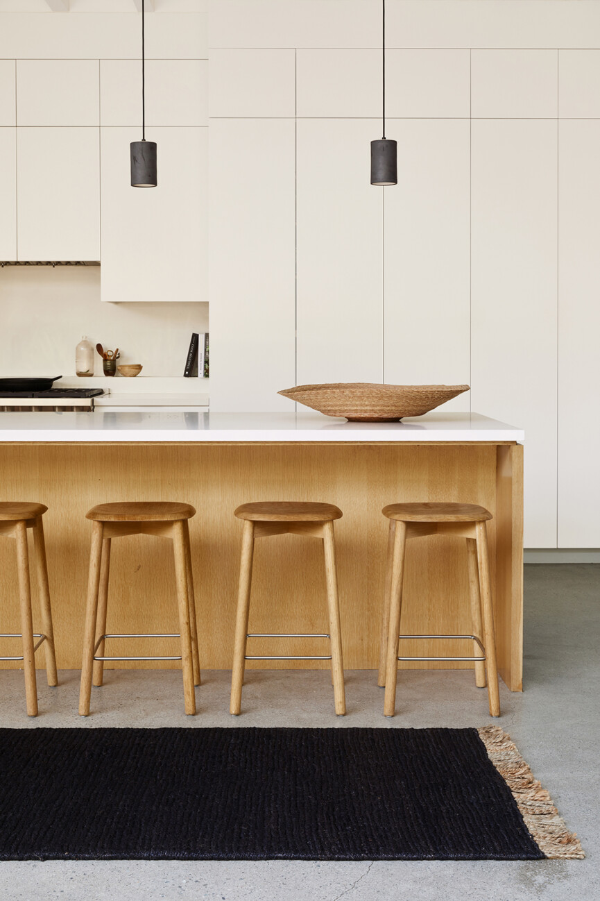
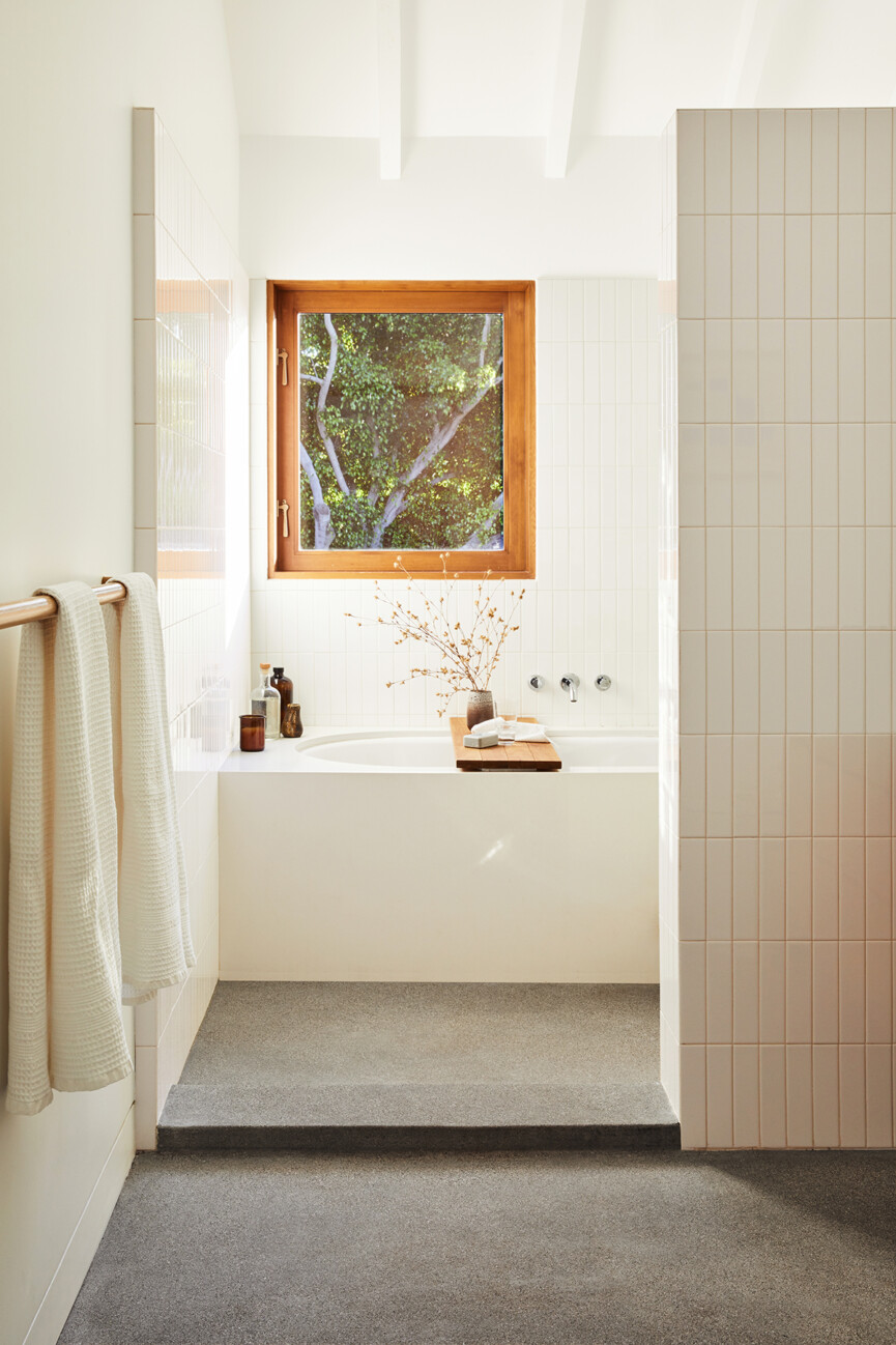
As creatives, we wanted to create a sanctuary that would give our minds a break, leading us to move in the direction of avoiding color and adopting a neutral palette throughout our home.
What’s your favorite thing about the space?
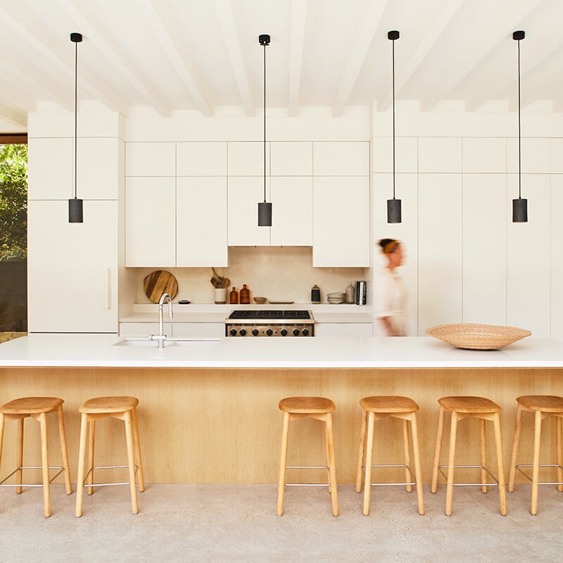
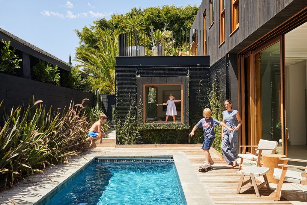
I just love the downstairs 10-foot cavity sliding doors which seamlessly disappear into the walls, opening up the kitchen right out onto the deck and the pool. One of my favorite things is being able to cook and socialize in the kitchen and watch the children in the pool simultaneously! It truly feels like there is no boundary at all, just this beautiful overflow of the inside into the outdoors. It’s user-friendly without compromising on style, which really distills the ethos behind the Venice House of marrying functionality with architectural joy.
Do you have a favorite piece of furniture? If so, what makes it the perfect piece for your home?
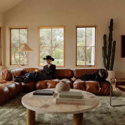
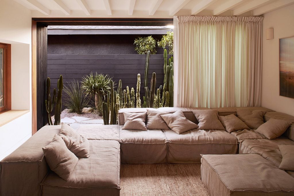
For the living room, we worked with Eco Outdoor to have a sofa custom made from 100% Belgian linen. It is not only coated for outdoor use, with covers that could be removed and machine-washed but can literally be hosed down! It was the perfect harmony of aesthetic and ergonomic joy, as well as sensible practicality. We also didn’t want to wait until the kids left home before we got a natural linen sofa!
What were your greatest finds?
I adore the wooden carved bench in our entry for the organic shape and its solid and grounded nature. It is such a beautiful piece to welcome anyone into our home.
Did you run into any budget or timing constraints? If so, how did you work to resolve them?
We were well aware that we would most likely run into budget and timing constraints given our taste and expectations, so we deliberately took our time with the design and build, which allowed for easier cash flow. We also found that often budget issues were always not a bad thing, as those situations made us think harder about the problem at hand, and most of the time we came up with more interesting and thoughtful solutions.
What do you think your home says about you?
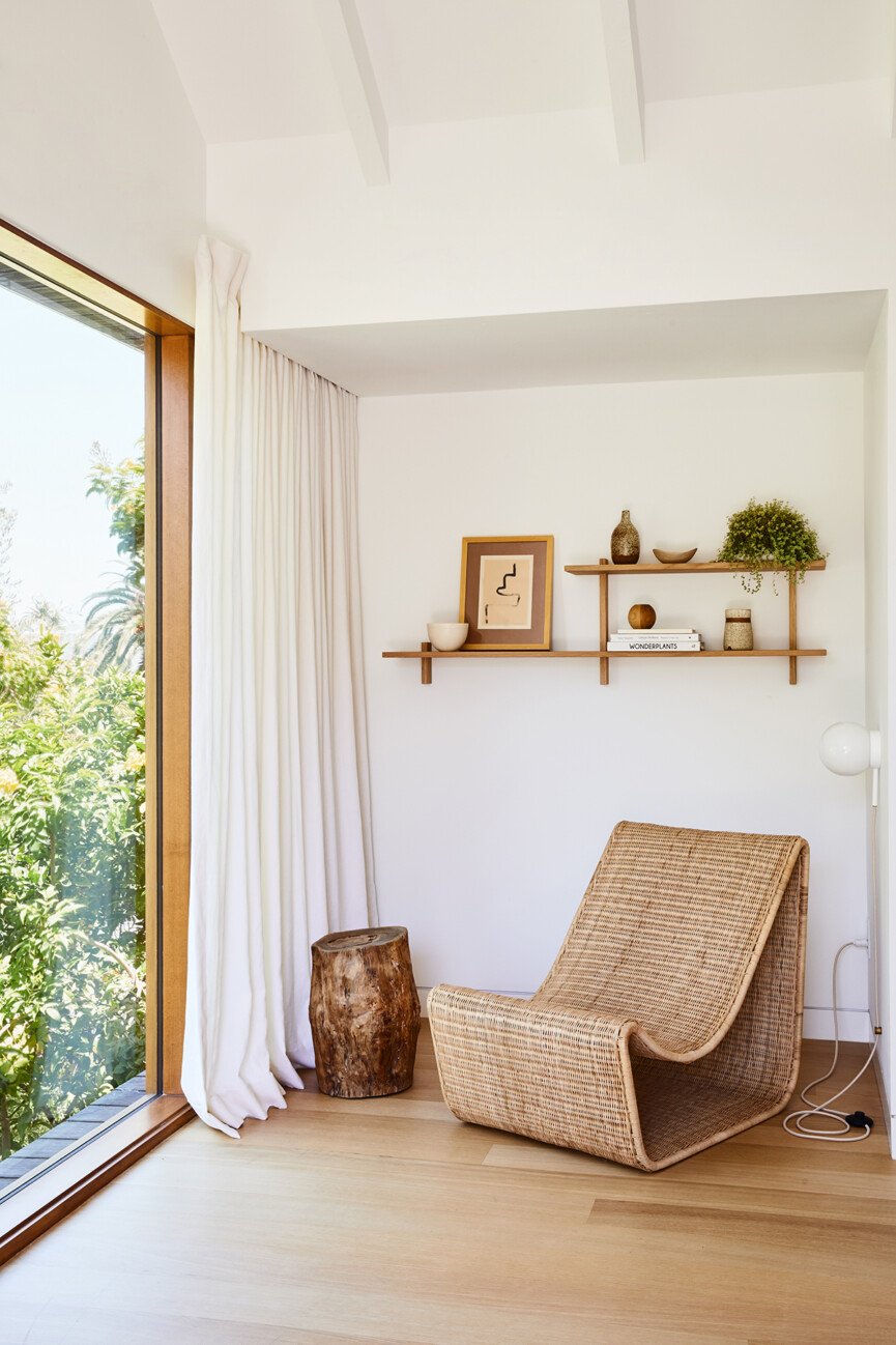
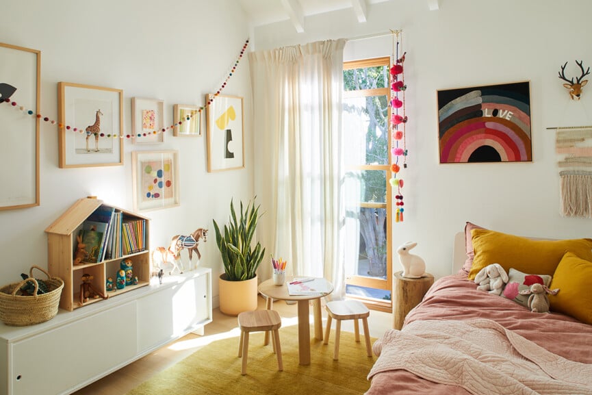
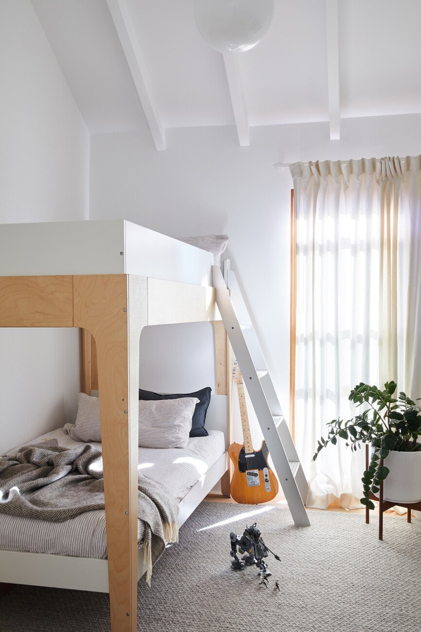
We hope that the space reflects the value we place on having a home and welcoming others into our sanctuary. We wanted to create distinct characters in the home. The open, public spaces of the house, that are social and loud with family activity, are downstairs. The upstairs, by contrast, is discreet and quiet and the spaces are all spaces of retreat.
We love the nuanced, neutral, and minimal approach throughout—how do you keep your designs so balanced and timeless while still warm and approachable?
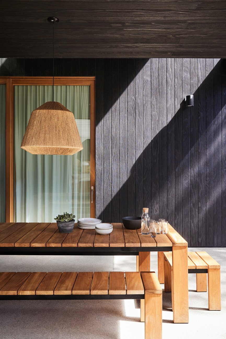
We wanted our house to feel like it could be fearlessly lived in and truly enjoyed, not delicate or overly precious. With a young family, it had to be strong and robust, so the priority was to choose materials, surfaces, and finishes that would withstand everyday use. It takes time and a bit of hunting, but it can be done. We also found that a “less is more” approach for the interiors truly let the architecture do the talking, balancing the space with more relaxed luxury.
Can you outline your minimalist approach to designing? What role does color play when designing/styling your home?
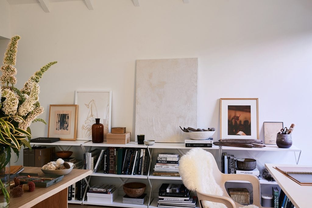
What is so special about the Venice House is that it is completely tailored to our family, giving us permission to make what some might see as unconventional decisions. For instance, because Greig and I both have very busy creative day jobs, we made a conscious choice not to fill our home with a heap of things. There is very little art hung on our walls because we both spend all day looking at images and when we come home, we want to have the literal blank space to unwind. For the most part, we’ve also avoided color because sticking to a neutral, monochromatic palette gives us the chance to reset creatively. There is a real joy in having a home that so pointedly suits your needs.
How regularly do you edit your home? In a bid to keep your space so pared-back and minimal?
I think it actually starts with being really curated and considered about what you allow into your home. Here at Armadillo, we are real advocates for the slow design philosophy, which is about choosing objects with longevity in their aesthetic and quality, that either has real functionality or bring you special joy. In this way, the home becomes an ever-evolving place where you can simplify, slow down and engage more deeply with the people around you.
Any advice for creating a space that’s minimal yet still warm and inviting?
Texture, texture, texture! It’s possible to adhere to a minimalist aesthetic but still make your home feel rich and interesting by keeping the palette neutral but leaning into contrasting textures—rustic and refined, soft and hard, subtle and bold.
Do you have any words of wisdom to share with would-be decorators about to embark on a home design project? What advice can you share for those who are new to design?
If this is your first project or even if you’ve got some experience under your belt but there is a level of complexity involved, it’s important to find experts that you can trust. Building or renovating a home can be one of the most stressful moments in our lives, so having an architect, builder and interior designer you can depend on and openly communicate with is key to riding out the bumps in the road.
Any design tips or tricks you can share?
Try as much as you can before committing. We would map out in blue tape on the floor potential pieces of furniture, we would stick colors of artwork on walls, build mini versions of kitchen islands out of boxes, and hang fabric from windows and do loads of photoshop mockups. We were determined not to have any unwanted surprises!
What’s the best piece of decorating wisdom you’ve ever heard?
Take your time and live and get used to the space before you start decorating. So many people told us this when all I wanted was a perfect home full of everything I had bookmarked over the years the minute we finished the build. But I learned that the more time you spend discovering how the light plays, understanding how you use the space, and figuring out exactly what you want to feel in a space, this will help to really make your choices meaningful and authentic, rather than just “decoration”.
How has COVID-19 impacted your relationship with your home?
For all of us, there has definitely been a newfound appreciation for our homes as a place of refuge and comfort. At the same time, spending so much time in one place has made us realize how much our surroundings can shape our energy and emotions, so it’s forced a reckoning on what we really need and want from each space. Multi-functional spaces are here to stay but we also need quiet spaces where we can be alone and unwind. Above all, though, I think COVID-19 has taught me that home is really wherever my family is.
Describe a typical work-from-home day…
I am an early bird. With the Armadillo team spread over so many different time zones, I like to use the quiet early hours of the mornings to get on top of things, then by the time the morning school hustle starts, I have already got three hours of work under my belt! I always ensure I implement some work-life balance with pilates at home or in the studio, connecting with other creatives and cooking. With all this working from home, it is more important than ever to make sure you focus on breaking up your day.
