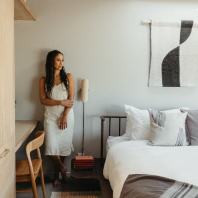
Modern minimalists on the hunt for home design inspiration are likely well versed in the Instagram of Sarah Sherman Samuel. The designer and influencer’s page is awash with striking scenes that stand out in the internet’s sea of homogenous home décor. Samuel’s style might look simple at first, but the careful layering of color and patterns creates something truly unique. And though the designer typically sticks to soothing, natural hues, Samuel just debuted a boldly renovated guest bathroom in her Michigan home that takes her effortless look to a Parisian level.
The goal: a guest bathroom that could transport visitors to a boutique hotel, a plan that also allowed Samuel to have a little fun. We’re talking striking checkerboard pattern-lined space with fixtures finished in a Champagne bronze (warm, but not too blingy). The undeniable focal point, however, is the oversized Allied Maker sconce surrounded by marble—not even the freestanding tub could compete.
The project also offered Samuel the opportunity to finally incorporate her own line of door and drawer fronts with Semihandmade. They make semi-custom door fronts for IKEA cabinets and are likely the common denominator behind your favorite kitchen inspiration on Pinterest (the company has worked on past projects with Karlie Kloss, Emily Henderson, Athena Calderone, and Justina Blakeney).
We spoke with Samuel about the design process, the inspiration behind her bold choices, and advice for aspiring bathroom renovators who want to make their space interesting, but not too overwhelming.
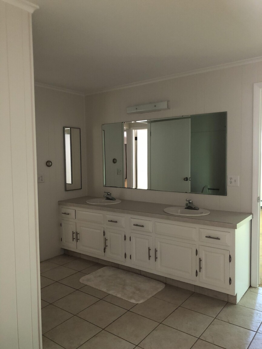
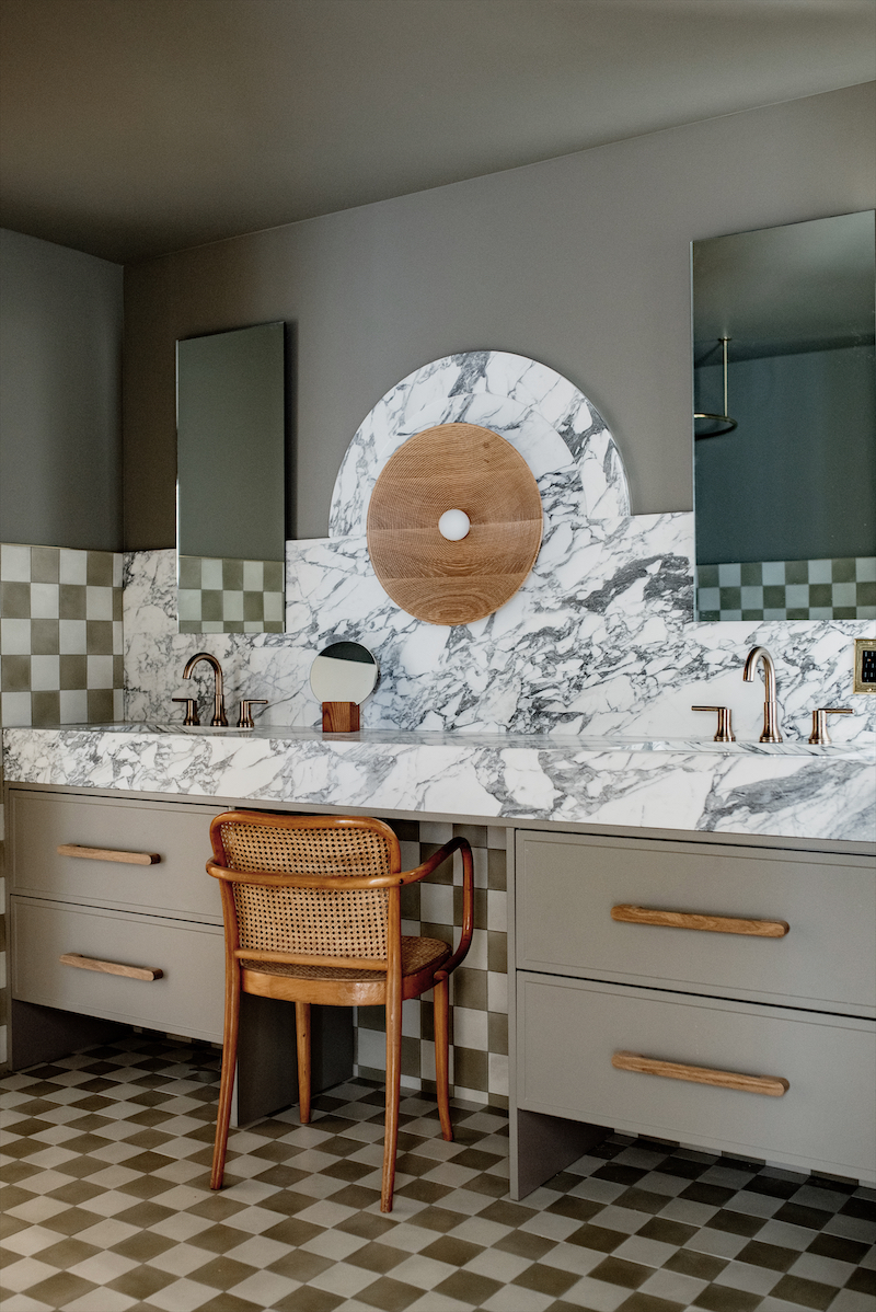
You mention wanting the guest bathroom to have a boutique hotel feel. Were there any destinations you took inspiration from?
Sarah Sherman Samuel: I was inspired by my trips to Paris—the special touches in a Parisian cafe and classic motifs of the checkerboard pattern.
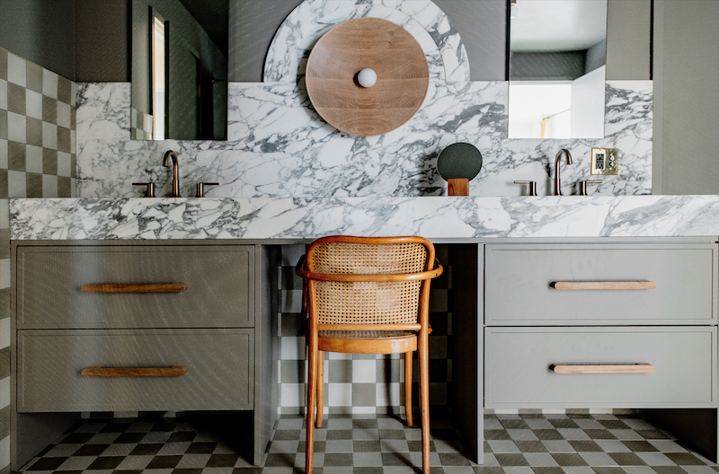
The oversized Allied Maker sconce is incredible. Do you have a favorite feature about the space?
The touch of wood from the sconce is so pretty, and the marble accent around that sconce makes that focal point my favorite feature.
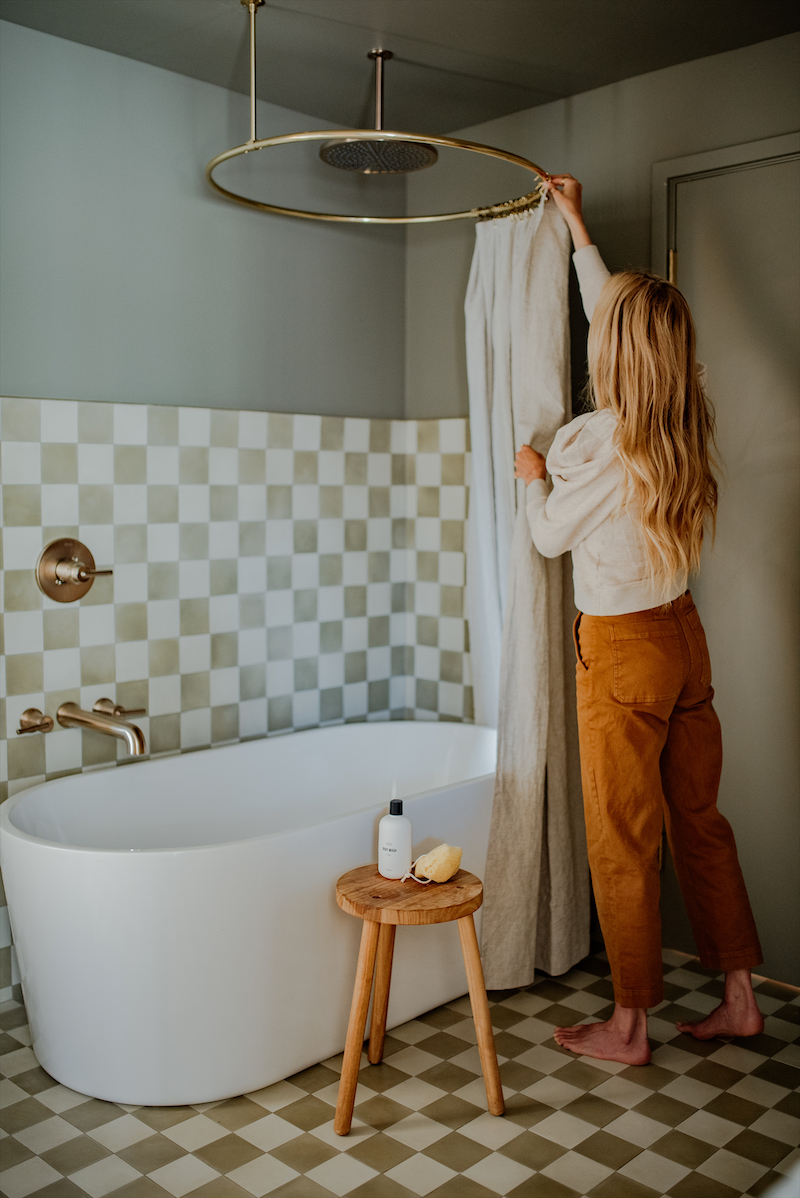
What are some items you always ensure a guest bathroom is stocked with when visitors are over?
I like to leave a carafe of filtered water with drinking glasses, freshly laundered towels, and bath salts for soaking.
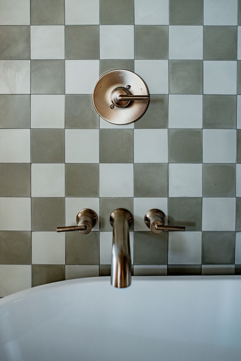
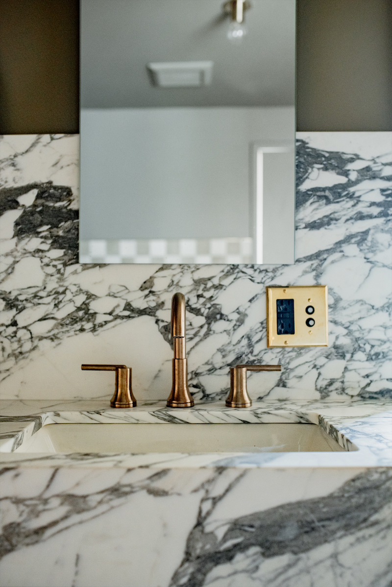
I love how bold the color is. For those wanting to try something beyond neutral, would you recommend designing the guest bath?
I wanted to highlight the Desert Grey color from my Semihandmade collection (it was my first time getting to use my own Quarterline collection), and I had it color-matched for the paint and used it on the ceiling, door, and trim to go really bold. With it being a guest room—since it’s not a room you use every day—you get to go a little bolder and have more fun with the design.
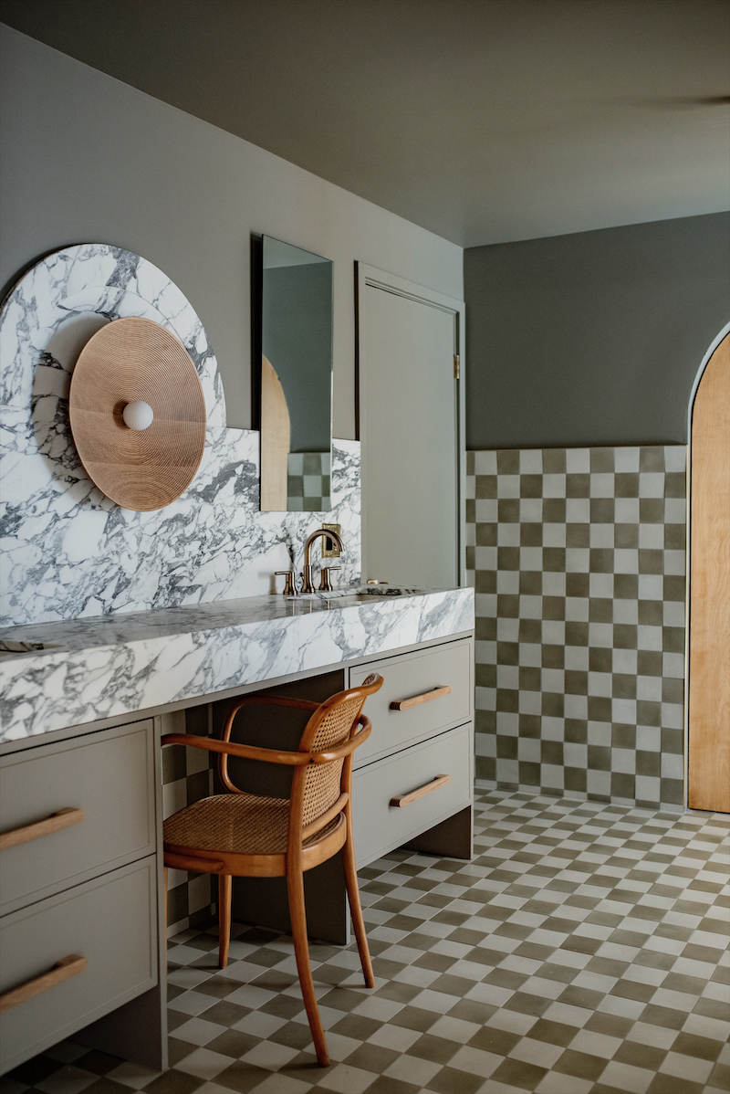
Any words of wisdom for those trying to have a little design fun with their own guest bathroom?
Build around a central focal point for an interesting but not overwhelming room.
Describe the aesthetic of the room in three simple adjectives: Bold, thoughtful, interesting.


