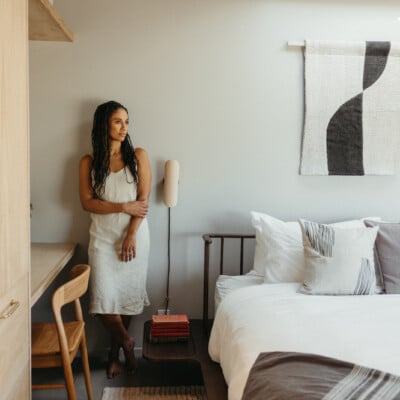
Despite the “boxy, cookie-cutter façade and builder-grade finishes,” Regan Baker saw huge potential in the bones of this 1961 mid-century modern home. But it was the peaceful woodside hills and lush greenery of San Francisco’s Forest Knolls neighborhood (complete with views of the Sutro Tower) that really stole her heart. “It feels like our own real-life treehouse,” she tells me.
“We were immediately drawn to the tranquility and made sure to expand the house in ways to retain the views. Despite being in a city it feels like a little slice of the country.”
With 17 years of experience, the founder, and principal of Regan Baker Design firmly believes design should be comfortable, modern, and personal, and she certainly brought all of these elements into the mid-century family home which she shares with her husband and 11-year-old twins.
Photography by Roland Bello
Baker wanted to retain the mid-century feeling of the home but also highlight contemporary design themes while injecting pops of color to break up the neutral space. In fact, the home was inspired by the book The Wes Anderson Collection which can be seen in the clean lines, vintage-inspired colors, and unexpected details throughout. The palette is surprisingly fresh and unexpected, revealing Baker’s love of using color in elevated ways.
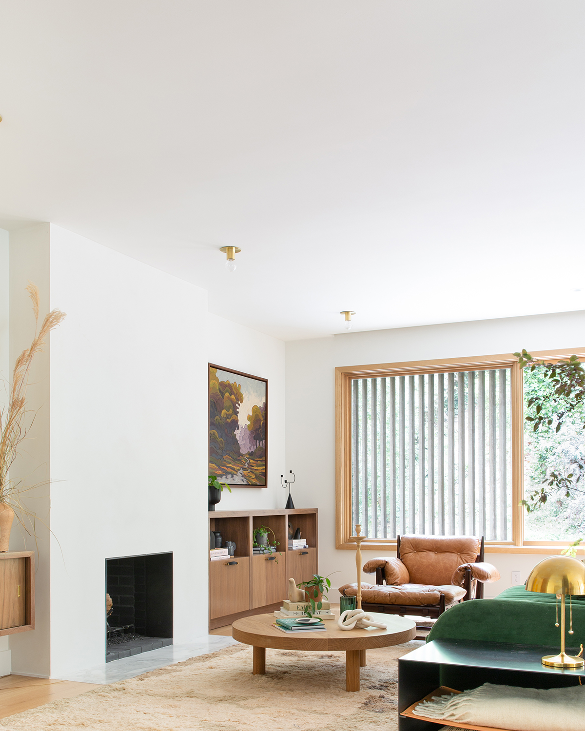
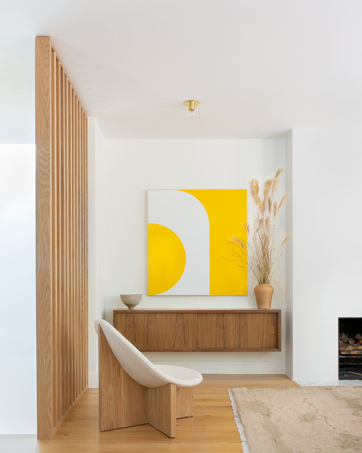
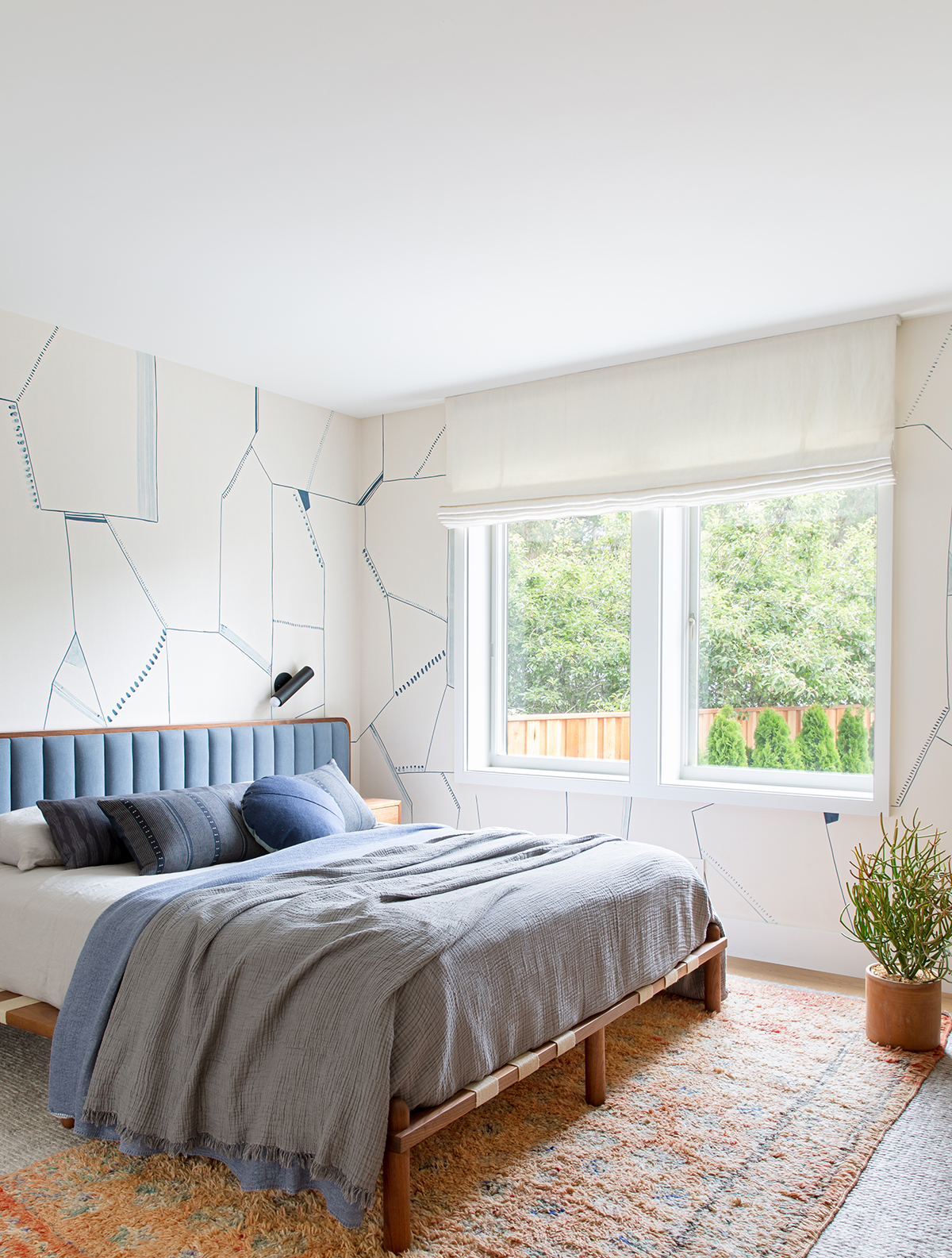
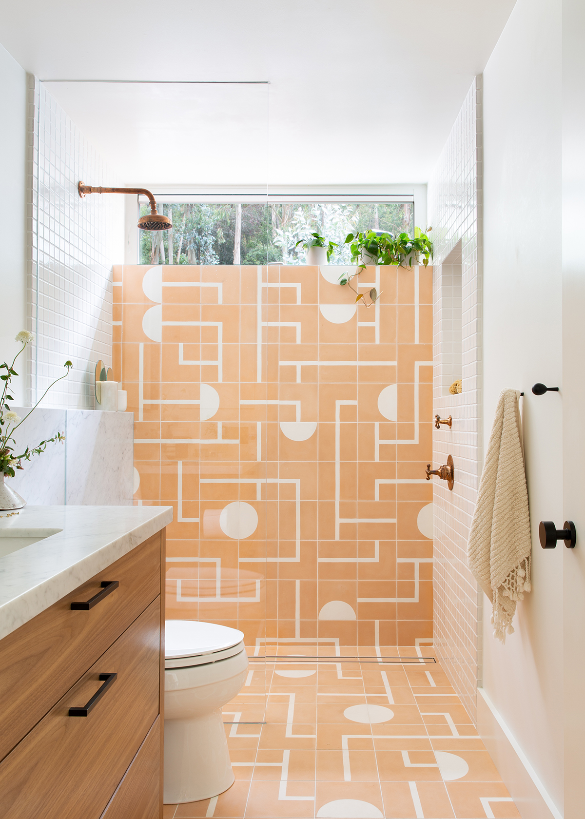
Many rooms have a colorful statement piece—for example, in the living room, the art by Richard Laing Studio adds a pop of yellow and brightness; the deep emerald green sofa brings the living room to life; the papaya tile adds an element of fun in the primary bathroom; the painterly wallpaper is a visually arresting in the primary bedroom and kid’s bathroom—always paired with a palette of light neutrals. “Although the result is an overall harmony of color,” says Baker. “The goal is to continue to surprise you as you walk through the home.” We think she nailed it.
Photography by Roland Bello
But one of the most impactful ways Baker transformed the home was through a complete reinterpretation of the floor plan. To create a more open and spacious feel, she raised the ceilings on the top floor, lifted the door frames, and converted one of the parking spots into additional, livable square footage, essentially transforming it from a 2 bedroom 1 bath to a 3 bedroom 3 bath. “My goal for this home was to maximize the space for my family,” she explains. “We created the illusion of additional square footage by creating storage to hide bulky items and little tricks like extending the door thresholds up to the eight-foot-high ceilings.”
Photography by Roland Bello
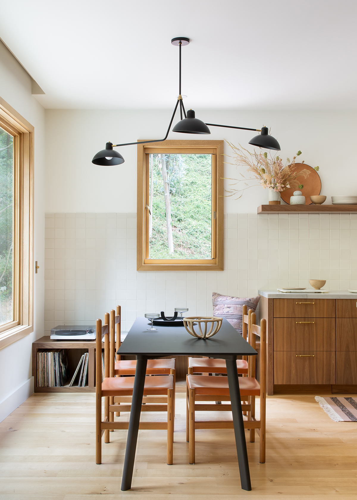
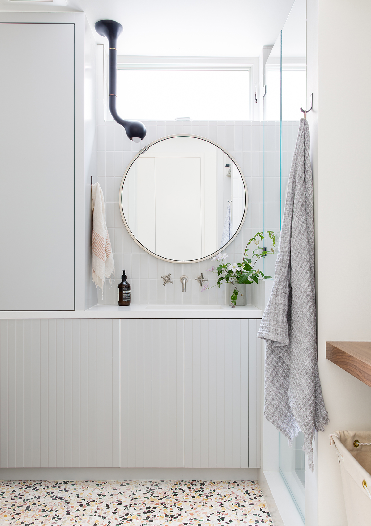
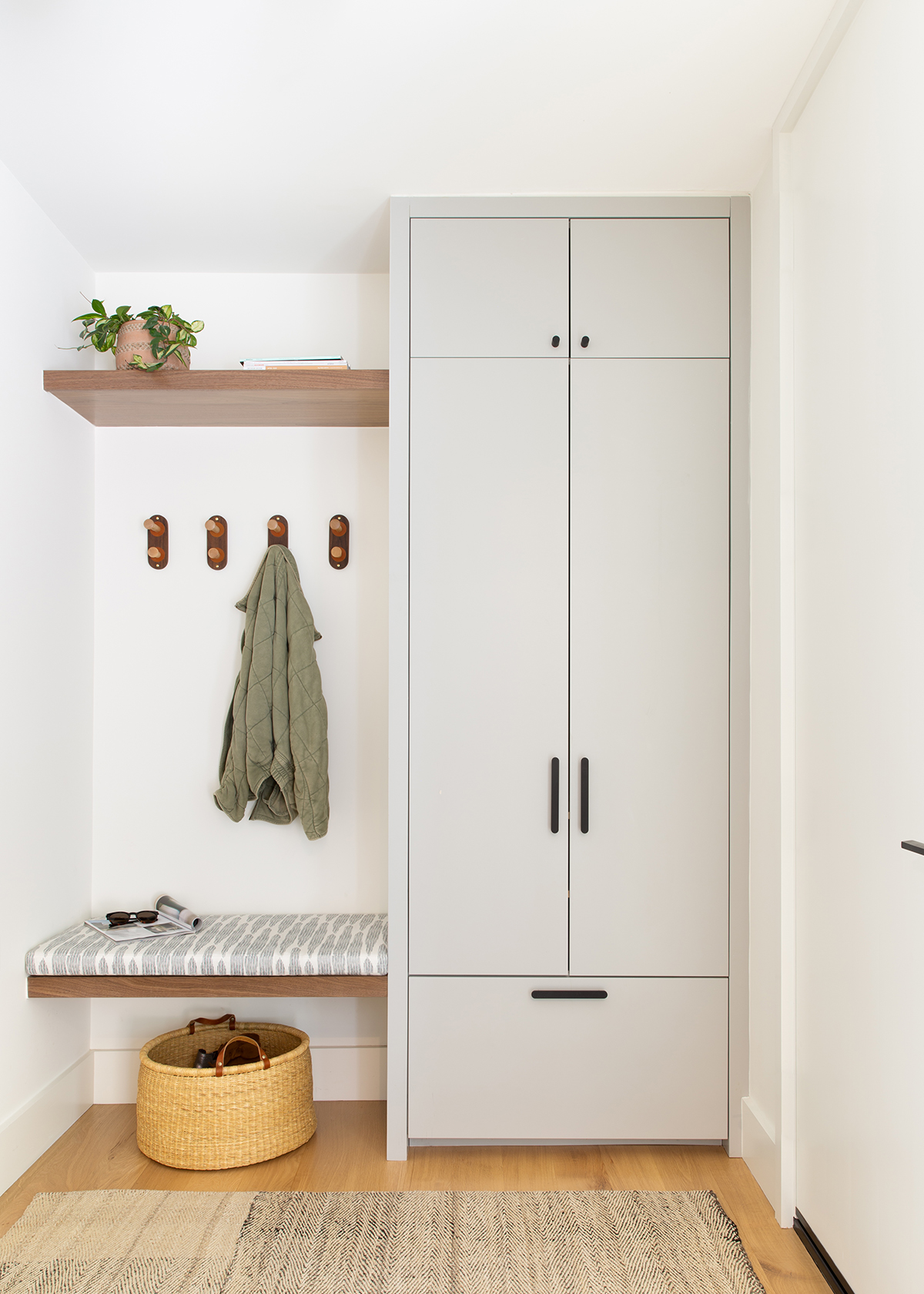
With design, Baker always likes to start with a combination of the program (the practical aspects of living in a home) as well as the overall palette. “We wanted each part of this home to be efficiently used,” she remarks. “For example, our guest bathroom also serves as the laundry room, and our family room has a pull-out sleeper for guests and office space for working from home. Millwork design plays a huge role in this because it’s essential to have a place to tuck away all belongings.”
Photography by Roland Bello
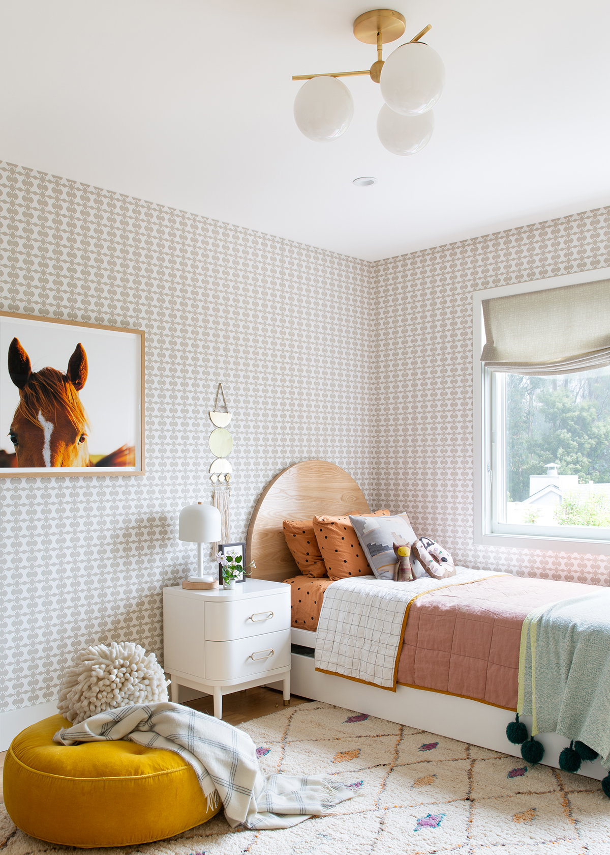
With regards to decorating, Baker loves to add an element of surprise in every space—a small but quirky nod to the homeowner’s personality. “In my daughter’s room, for example, we used a wallpaper that looks textural from far away, but up close you can see horses, and she loves to horseback ride!” Her love of wallpaper continued into the primary bedroom and the kid’s bathroom, too. “I love the wallpaper we used in the kid’s bathroom,” she adds. “It’s the Geo hand-painted paper by Porter Teleo and we paired it with a matching shower curtain. I love how artistic it feels and creates that element of surprise next to a basic white tile.”
When it comes to inspiration, Baker draws a lot from fashion. “In fact, whenever I start a new project, I like to look into the closets of my clients because it says a lot about the colors and textures they love,” she notes.
Photography by Roland Bello
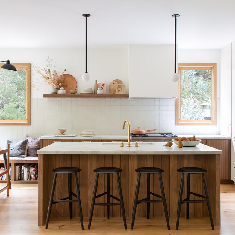
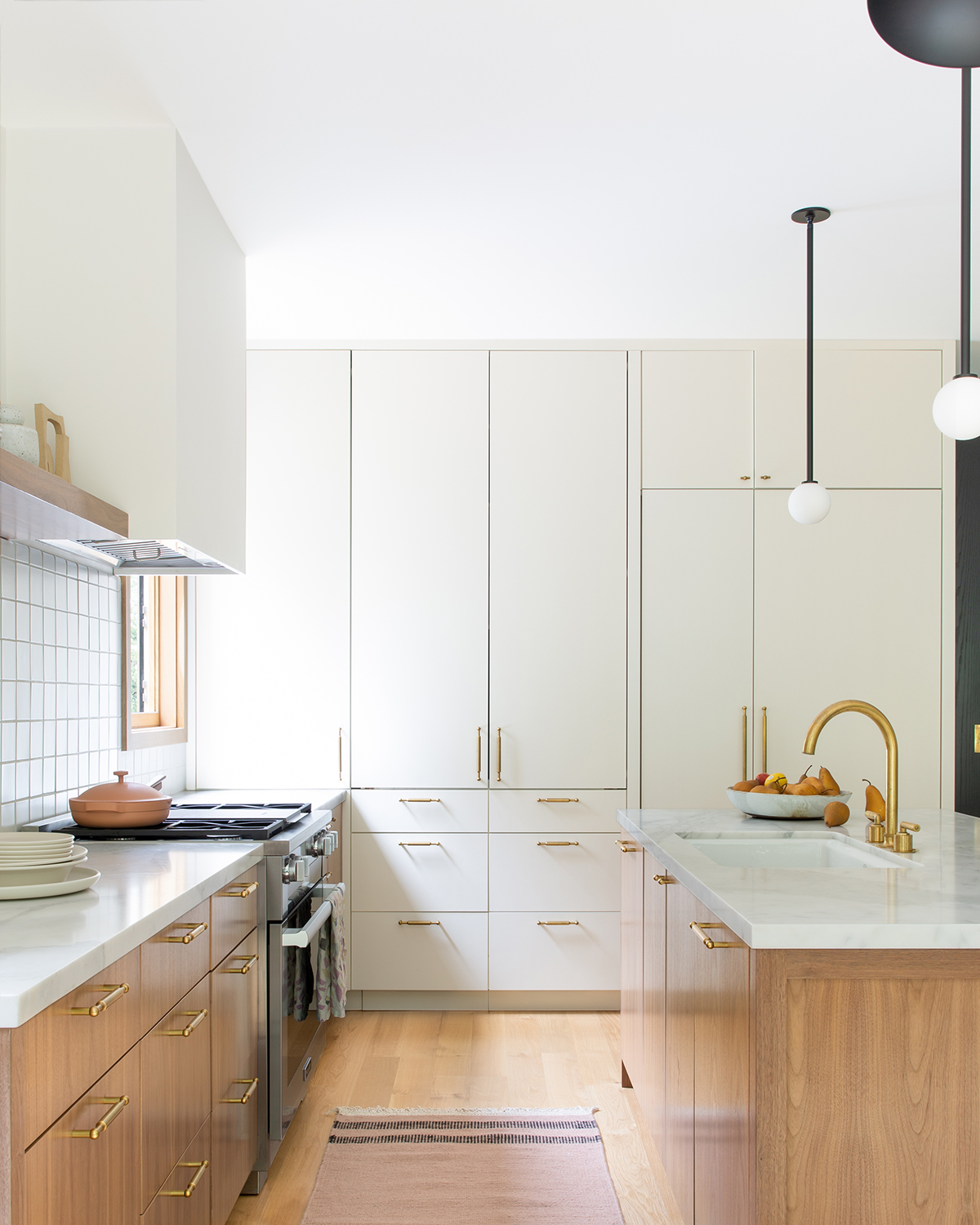
Speaking of texture, this was key to creating visual interest in Baker’s nuanced and neutral home. “It allows the use of neutral colors, but still adds depth and layers to spaces,” she outlines. “For example, in the kitchen, we used a white square tile with light grout, and added a wood shelf to add an opportunity for styling. The styling can evolve over time, and wood is timeless. We did some wood paneling at the island to create that texture and interplay with the square tiles.”
Photography by Roland Bello
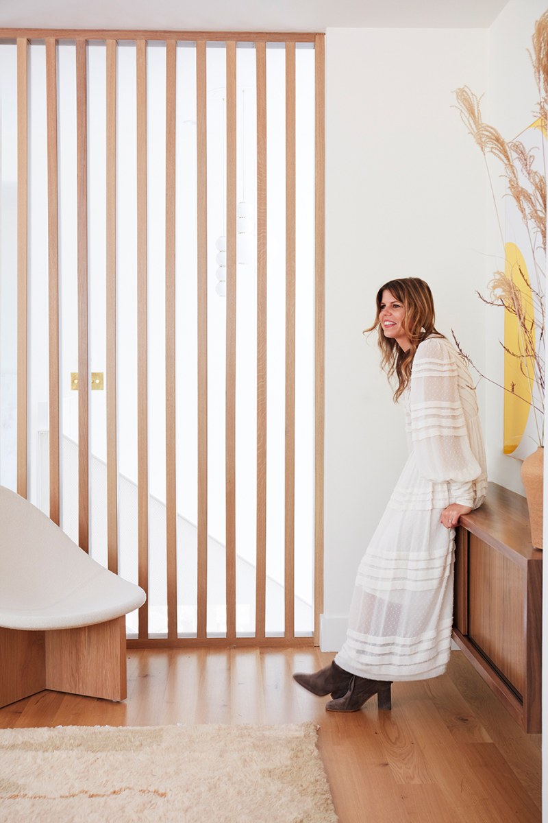
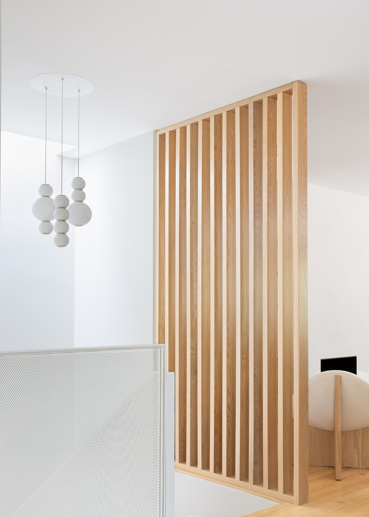
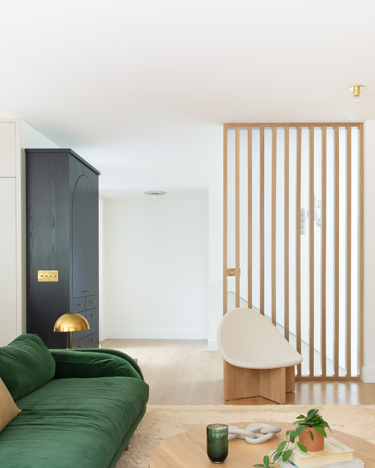
When it comes to her favorite design feature, Baker immediately noted the wooden louvers used at the stairs to separate the stairwell from the living room. “They mimic the louvers on the outside of the house as well,” she says. “It’s a great way to let light in from the skylight overhead, but still have a physical separation between the spaces. The louvers on the outside of the house add a quirky element of surprise!” We couldn’t agree more.
 Photography by Roland Bello
And for the most loved piece of furniture? Well, that’s easy; the emerald green sofa in the living room. “It’s deep, comfy and I love how it relates to the forest all around us,” she explains. “Lawson Fenning is one of my favorite vendors, and we covered the sofa in a Dedar Milano cotton velvet fabric. Another favorite is the vintage Mole armchair and ottoman by Sergio Rodrigues. I love mixing old and new and together these two items make for a very inviting space.
Photography by Roland Bello
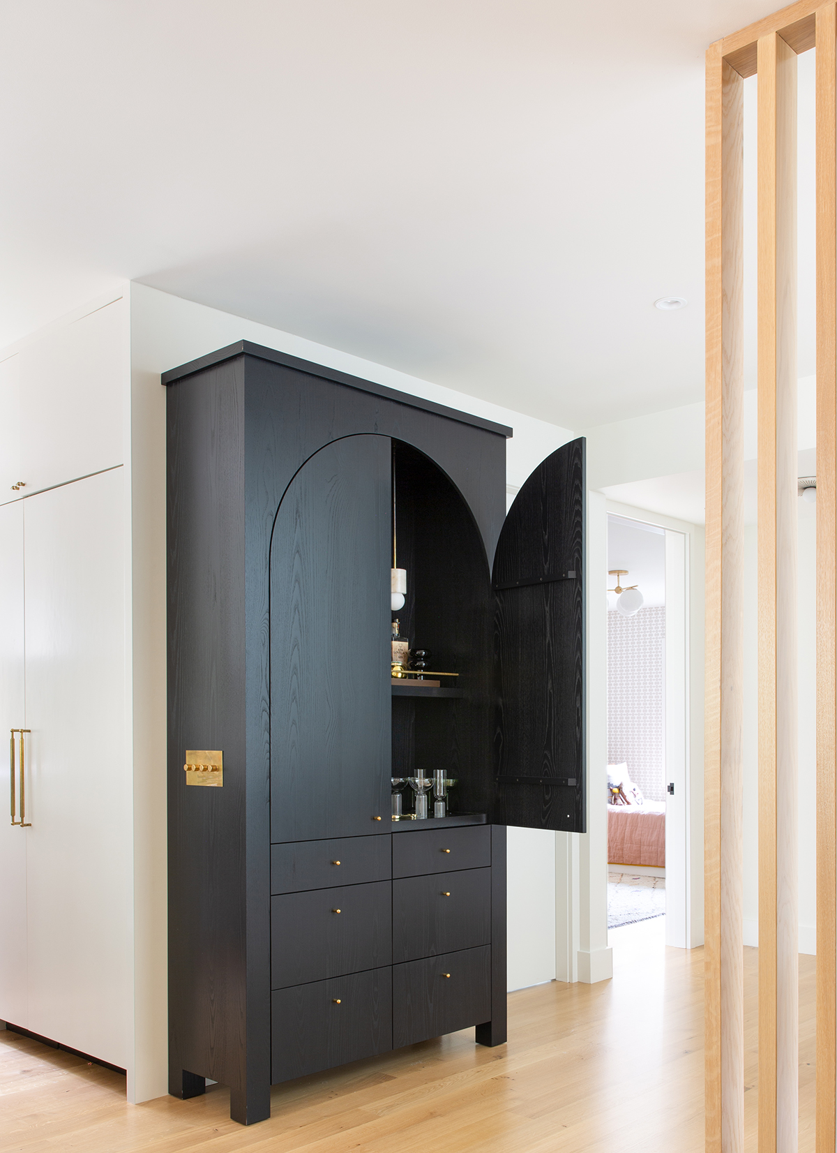
When asked what she thinks her home says about her, Baker says it showcases her love of the small details. “This is what can make or break a design. Thinking through tricky transitions and how all elements in the home interact with each other is such an important part of design. For example, we operate the living room light switches using a Forbes & Lomax cover plate which is integrated into the side of the built-in bar. And when you open the bar door it turns on a light inside! These integrations are fun, practical, and also look good!”
Photography by Roland Bello
Of course, the biggest challenge she ran into was the budget but like any design project, Baker’s team was really focused on sticking to it and completing the work quickly while they lived in a rental. Her major tip for staying on track? Have as many of the design details figured out in advance to minimize the number of surprises along the way. In addition, Baker says being overly communicative with the contractor is essential so they get the answers they need to keep pushing the construction process forward and aren’t blocked by design decisions.
Photography by Roland Bello
For Baker, it is true what they say, that designing your own space is often the toughest. “It can certainly be tough because the possibilities are endless,” she remarks. “But it’s also really fun. My 11-year old twins had the opportunity to help design their own spaces which they loved.” For those who are new to design, she says to “trust your gut and always order samples! It’s so important to touch and feel materials. It’s easy these days to get stuck on the computer but design is so tactile.” Amen.
Photography by Roland Bello
When asked to describe the aesthetic of this project in three simple adjectives, Baker simply states: Comfortable. Warm. Inviting. “It’s all in the finishing touches,” she states. “Curate the best pieces that represent you and the home rather than what’s trending. Plants and art can also instantly transform a home into an inviting space.”
Photography by Roland Bello
As for decorating wisdom? “Create a space for everything,” she advises. “It helps reduce clutter and allows you to still have the pieces you love most. If you prioritize and customize storage, it becomes a no-brainer.” And for those about to embark on their own home design project, Baker urges you to take your time. “There are always unexpected challenges with every home design project, so it’s best to be prepared as much as you can be,” she adds. “Also, have fun! It’s such a unique experience to be able to think through the details of how you live and how you want to live so savor each moment because design truly does impact our moods and how we live our lives.”
Photography by Roland Bello
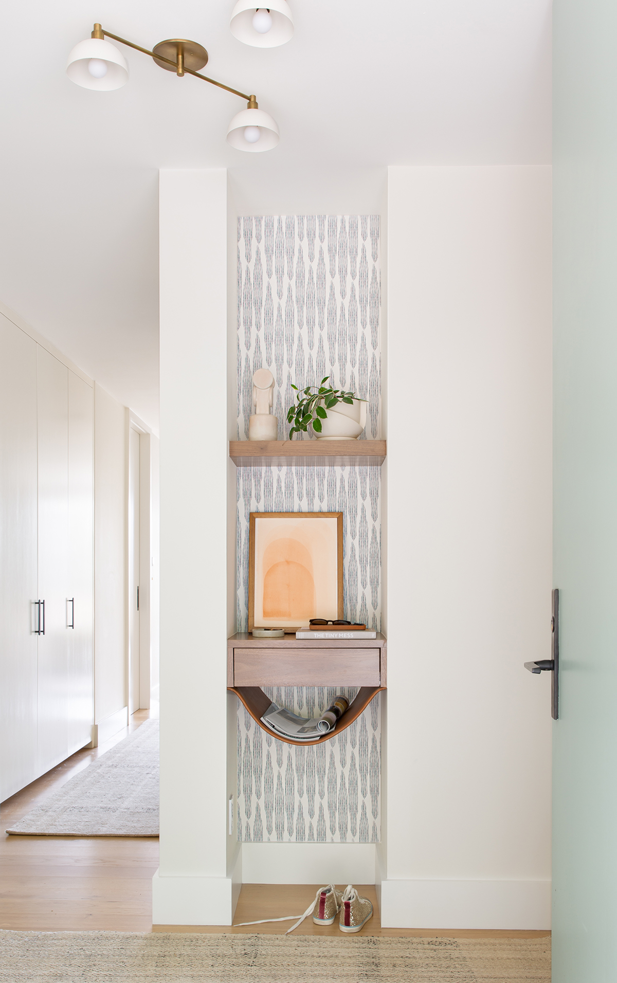
But if you really want to design a space you love, Baker recommends creating mood boards first. “It’s always a good idea to figure out the look and feel of each room, and ultimately what you want out of the space,” she says. “From there, you can figure out what you use with what you currently have and what needs updating.”
Photography by Roland Bello


